The National Broadcasting Company has changed its logo more than once over its more than 80-year history. During the last three decades, it mainly used variations of the peacock emblem.
Meaning and history
NBC was founded in 1926 as the first U.S. radio network, and expanded to television in 1939.
In 1986, NBC was bought by General Electric for $6.4 billion. In the 1990s, NBC became the first among all television networks in America, thanks to its popular series: Friends,ER,Frasier,Seinfeld.
In 2004, NBC merges with the French media conglomerate Vivendi, and NBC Universal is formed. In 2010, the company was bought by Comcast.
The first decision of Comcast management after the acquisition of NBC Universal was to get rid of the peacock’s tail, which decorated the logo of the media company. The deal was completed this week. However, this mascot, which has been the symbol of NBC since 1956, will remain on the logos of NBC, as well as cable operators MSNBC and CNBC.
What is NBC?
NBC is an abbreviation, standing for the National Broadcasting Company, an American news television, and radio network, which was established in 1926, and today is a part of NBCUniversal, a part of the international Comcast Corporation, one of the most reputable players on the media and entertainment global market.
1926 – 1931
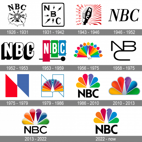
NBC started working in 1926. It was established as a radio network and used an image of a microphone as an emblem. There were lightning bolts all around the microphone. In two years the second logo appeared. It featured the NBC wordmark inside a square shape. When NBC became a television network in 1942, it adopted the same emblem.
1931 – 1942
The redesign of 1931 kept the lightning bolts but made the NBC logo stricter and simpler. It was a diagonally set lettering (from the upper left corner to the bottom right one” with five bold black lightning bolts around, enclosed into a thin black square frame with rounded angles. The emblem stayed with the company for almost a decade.
1943 – 1946
It was only in 1943 that the television network introduced its own logo. It was a microphone with lightning bolts all around and actually looked very much like the 1926 emblem.
1946 – 1952
In 1946 the company started using a very simple yet elegant logo, with only the uppercase inscription written in black on a white background. The lettering was executed in a traditional italicized serif typeface with bold yet sophisticated lines and slightly sharpened serifs on their ends.
1952 – 1953
The logotype becomes more modern and strong in 1952. The italicized serif font is being replaced by a bold and strict sans-serif, while the black bodies of the letters turn white and gain a thin black outline and a thick black shadow. Now each letter looks like a solid and strong building block, showing the company and stable, reliable and confident.
1953 – 1959
In 1953 the xylophone NBC logo was created. The visual emblem was accompanied by recognizable chimes played as a seven-tone sequence.
1956 – 1975
Two years later, the famous peacock logo was adopted. It was designed by John J. Graham. The stylized bird had eleven feathers, which was supposed to emphasize the richness of colors the television network used (it had just increased the color programming). The next year, an animated peacock was introduced.
In 1962 the peacock emblem was slightly modified. The bird appeared against a kaleidoscopic background. The “Laramie Peacock” version of the emblem was used only to introduce the programs made by NBC itself.
1958 – 1975
Shortly before its fiftieth anniversary the network introduced a trapezoid “N” emblem consisting of two trapezoids – red and blue. Three years later, a so-called Proud “N” logo appeared, where the peacock was used again.
1975 – 1979
In 1975 the most abstract and unusual NBC badge was introduced. A geometric image, composed of red and blue segments and white negative space. The composition looked like a stylized letter “N”, though also had a very intriguing and artsy character, pointing on the same sides of the company, and showing it to the audience under a new angle.
1979 – 1986
The iconic NBC peacock first appeared on the logo in 1979. It was a fancy bird with its body drawn in white and outline in blue, and its tail in all colors of the rainbow. The image was set over a thin blue outline, repeating the shape of the geometric “N” from the previous version of the logo.
1986 – 2010
The contours of the peacock were refined in 1986 and the “NBC” logotype was added to the graphical image. The bird was enlarged and placed above the black uppercase lettering written in black and executed in a solid and stable sans/serif typeface with thick lines, clean contours, and classic square cuts of the lines.
2010 – 2013
The redesign of 2010 added some glance to the NBC peacock, creating a feeling of a three-dimensional metallic surfer by adding some gradient shades and replacing white elements with gray. As for the lettering changed it was completely removed from the logo.
2013 – 2022
Since 1986, the NBC insignia has been part of the logo. The peacock emblem itself has not changed much since then. One of the most recent modifications of the NBC logo took place in 2013. The “NBC” inscription in a newly-designed type was placed below the 3D peacock.
2022 – now
The redesign of 2022 has brought back the flat and clean NBC logo, designed in 1986, with some strengthening of the elements’ contours. The iconic peacock in a two-dimensional style is now complemented by a thick and sharp NBC lettering in a modern geometric sans-serif font, which looks stable and actual.
Snake symbol
In 1959 the network created one more symbol. It was used in addition to the bird emblem. The new logo featured the NBC insignia in which each letter grew from the other. It was called the “NBC snake” and had several variations.
Font
For most of the time, the “NBC” wordmark was part of the logo, but the typeface itself was changed dramatically. The 2013 version includes a minimalistic sans-serif type.
Color
The emblem sports a rich color palette, including yellow, orange, red, purple, blue, and green. The diversity of colors seems quite natural, taking into consideration that the symbol depicts a peacock.
What does the NBC logo represent?
The bright logo of NBC depicts a stylized peacock with its tail drawn in six colors, each for one of the rounded “feathers”. The idea behind the badge is that each of the colors of the badge’s elements stands for one of the corporation’s directions: yellow is for the news section, orange — is for sports, red stands for entertainment, purple — is for the radio, blue — network, and green is for production.
What is hidden in the NBC logo?
The stylish and intense badge of the NBC corporation is a peacock, drawn in rainbow shades with glossy surfaces of the elements. Each of the feathers in the peacock’s tail stands for one of NBC’s directions. Also, the colorful palette of the badge is a tribute to color TV, as the badge was originally designed in the 1950s, then the transition from black-and-white to color started
How was the NBC logo created?
The iconic peacock from the visual identity of the National Broadcasting Company was designed by John Graham as a tribute to the color TV. The director of the design of NBC was inspired by this transition and saw many possibilities in the colors and the meanings standing behind them.
Is the NBC logo a peacock or a turkey?
The iconic NBC badge depicts a stylized peacock, which was first introduced in 1956, and has been redesigned several times, turning into a sleek glossy logo with a silver outline in 2013. The peacock from this badge is not just a bright detail, but also has several meanings for the company.


