Napster is an online music sharing platform, which was created in 1999 in the United States. Today the service, owned by Rhapsody, provides various music-related services, including sharing and selling audio files.
Meaning and history
The iconic Napster logo is composed of a wordmark and an emblem on its left. Designed with a playful idea in mind, the Napster emblem depicts a cat, in response to a dog-logo of Lycos, which was the main competitor of the company.
What is Napster?
Napster is the name of an online audio-streaming platform, which was created at the end of the 1990s as a website, designed to share digital music files in MP3 format over a network connected to the Internet.
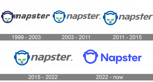
1999 – 2003
The cat in the original logo had darker eyes and a darker outline than in the current one. Also, the shape of the eyes was different – the parallelogram in the original logo and the leaf in the current one.
The lines forming the glyphs used to be a little more angular, with sharp turns, while the current logo is smoother.
Eventually, there was one more difference. There was a curve between the wordmark and the cat’s headphones in the old logo. This element represented the sound wave.
2003 – 2011, 2015 – 2022
The Napster wordmark in all the lowercase lettering is executed in a bold italicized sans-serif typeface with clean and neat lines. The lettering looks confident and traditional, which balances the modern and funny brand’s icon.
The emblem depicts a cat’s head wearing headphones. It looks stylish and contemporary era en in thick distinct lines. In the first version of the logo, the Napster cat featured sharper ears, which made it look like a devil’s head, so the original design was slightly modified and the ears gained a more rounded shape.
The monochrome palette of the nameplate logo makes it look powerful and adds a sense of authority. The black and white combination also allows to place the logo on various items, and it keeps looking good on any background.
2011 – 2015
The redesign of 2011 was left almost unnoticed, as the only thing changed was the typeface of the bold lowercase “Napster” inscription. The letters got a bit bigger, and gained straighter lines, although the color palette and the modern italicized style of the characters remained untouched. The most visible modification was made to the “T”, which is for its curved tail cut.
2022 – Today
In 2022 the Napster badge got its new life, with a refreshed color palette and emblem, redrawn in a sleek minimalistic way. The iconic cat got its face erased, so now it’s only bold contouring, where you still can see the sharp ears of the animal, and the headphones. As for the color palette — it was switched to electric blue, which looks modern and cool. The lettering on the Napster logo is now set in the title case and uses a straight and stable sans-serif typeface.
Font and color
The bold title-case inscription of the primary logo of the online streaming service is executed in a clean and solid sans-serif typeface, which is pretty close to such fonts as TT Firs Neue Demi Bold and Montreal Serial Bold, but with the vertical bar of the “T” drawn straight, without any elongated tail.
As for the color palette of the Napster logo, it is based on just one shade of blue, with both elements usually placed on a white background. The electric blue here looks juicy and fresh, adding uniqueness to the brand, and showing the company as a progressive and energetic one.


