The Mixer logo gives you a subtle hint at the fact that it belongs to a video game live streaming platform. It looks eye-catching, dynamic, and lean. Had the company survived, it would have been able to boast a singularly successful visual identity.
Meaning and history
The platform went live in early 2016 under the name of Beam.
What is Mixer
Mixer was a rather popular video game live streaming service available in over 20 languages. Its co-founders were Matthew Salsamendi and James Boehm. Microsoft purchased the platform in 2016 and made it part of its Xbox division. In the summer of 2020, the service was shut down.
2016 (Beam)
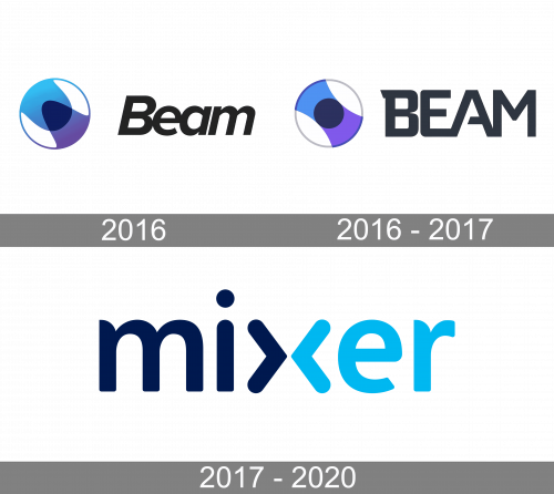
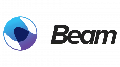
The earliest logo showcased a white circle with a blue outline. What’s more notable, the circle housed a whimsical combination of two partly overlapping waves. One of the waves was purplish, while the other one was light blue.
The wordmark, which was positioned to the left, was set in a pretty generic type. While the space between the emblem and the name of the brand was more than generous, the letters in the wordmark stood exceptionally close to each other creating a disproportional effect.
2016 – 2017
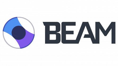
The problem of proportions was partly solved as the wordmark moved a bit closer to the emblem. The space between the glyphs is still scarce. In fact, the “E” and “A” stand so close to each other that they form a single glyph, whereas the “M” touches the “A.” Nevertheless, now this doesn’t damage the design. Conversely, it seems to create a dynamic effect.
The generic lowercase type has been replaced by a more unique uppercase one. The italics have been straightened.
The emblem looks more harmonious due to the symmetry and more like a CD, which adds some meaning. Then again, it lost its individual touch.
2017 – 2020 (Mixer)
Having purchased and renamed the company, Microsoft naturally introduced a totally new logo. The only features reminding us of its predecessor are the palette and the “prong” on the “m,” which vaguely echoes the shape of the “B” in the previous version.
This time, the emblem has disappeared. Yet, the wordmark itself has a pictorial touch as the central letter “x” reminds the buttons on a music device.
Also, the “x” adds some symmetry and helps to create motion. With the “x” being the most outstanding glyph, it’s only natural that the designers who stood behind this project decided to use it additionally as an icon.
Colors and font
The original palette, which paired black/dark blue with light blue and purple, was simplified in 2017 and reduced to two colors: dark blue and light blue.
In the same way, the typeface in the latest version of the Mixer logo is sleeker than the one used in the previous ones.


