Myspace is the name of a social network, created in 2003 in the United States. It was the most celebrated and attended social network site in America before the launch of Facebook. Myspace is a part of Meredith Corporation since 2018.
Meaning and history

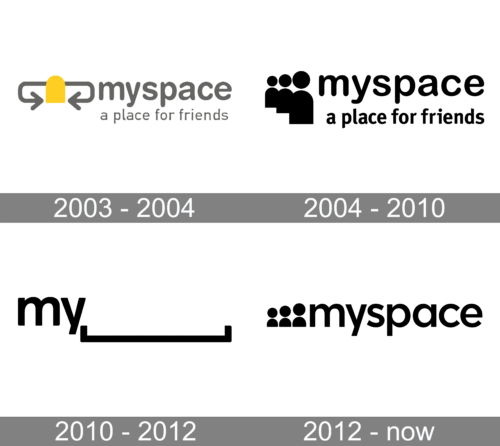
Throughout the history of one of the social networking pioneers, its visual identity has undergone some major changes, which resulted in a stylish and modern emblem we all can see today. The brand had various emblems in use — from the visualization of social networking to graphical and humorous representation of the portal’s name, and in the end, the simplest and the most modest version won.
2003 — 2004
The original MySpace logo was executed in a light gray and yellow color palette, where the lowercase lettering with a tagline was written in gray, and a stylized emblem used yellow as its main color. The MySpace emblem featured a schematic figure with a gray circular head and solid yellow body, and two curved gray arrows coming out of the body to the sides. It was a graphical representation of social life and communication via the Internet, which was only used by the network for a year.
2004 — 2010

The redesign of 2004 brought a new emblem, which became a predecessor of the insignia the whole world knows today. It was a monochrome badge, with an emblem, composed of three stylized figures in different sizes, placed diagonally along their bottom line, and a lowercase wordmark with “A place for friends” tagline in a simple rounded sans-serif font.
2010 — 2012
In 2010 the logo was redrawn again, making the logotype a star of the visual identity. It was a badge, available in two versions — with the whole wordmark in the lowercase, and the “space” part underlined with a square bracket, and the second option, with only “My” followed by a horizontally placed bracket. In the case of the second version, the space above the gap could be filled with various text and graphic content, depending on the needs of the service. This cool and progressive visual identity concept was used by the company for two years.
2012 — Today
Even though the previous logo was very successful and recognizable across the globe, the network decided to redesign it in 2012. The current MySpace emblem is based on the version, created in 2004, with three solid black figures created but this time they are placed in one line, varying in heights. The logotype in the lowercase is written in black and placed on the right from the emblem.
Font and color
The simple yet stylish MySpace logotype is written in the lowercase of a modern and cool sans-serif typeface with the full and rounded contours of the letters. The typeface is based on one of the following fonts: Zelda Demi Bold, Kontora Bold, or Visby CF Demi Bold.
The monochrome color palette of the MySpace logo is a representation of professionalism and confidence, which makes the simple and minimalist emblem trendy and cool, and accents on the quality and power.


