Google Analytics is an online service, created by Google in 2005. The platform is specialized in providing analytic services and statistics to its users. The service is available both in desktop and mobile versions and today it is the most popular statistics platform in the world.
Meaning and history
The visual identity of the Google statistics platform is strict yet friendly and bright. The logo, composed of a colorful emblem and a simple and light wordmark in its right, looks professional and reliable, evoking a sense of expertise and authority.
2005 – 2012
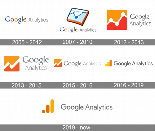
The original logo for the service was designed in 2005 and stayed with the company for 7 years, which is the longest among all the logos ever created for Google Analytics.
It was a simple and minimalist logotype, composed of two parts in two different styles — the signature colorful “Google” wordmark and a light “Analytics” inscription in strict gray color, placed on its right.
The second part was executed in a clean and neat sans-serif typeface, which balanced the bold and bright first part of the logo, adding a serious touch and evoking a sense of fundamental and professional approach.
2007 – 2010
In this version, the wordmark from the previous logo was paired with a bluish icon. The icon showcased a stylized graph drawn on a piece of paper (it appears to be a part of a notebook of some sort). The sides of the “notebook” were orange.
2012 – 2013
The first emblem appeared on the logo in 2012. It was a pretty fast going experiment, which stayed for only one year and was redesigned in 2013, but became a base for all the next versions.
The logo of 2012 was composed of an orange and white emblem, enclosed in a square. It featured a background with its upper part in light orange and its bottom part in a more intense shade, with a white graph line separating them. Their line was pretty tin and had three bold white spots on it.
As for the wordmark, it was composed of two levels — the upper one, “Google” in a bold signature font, and the lower one, “Analytics” in light sans-serifs both parts were written in gray, now the emblem became the only colorful element of the visual identity.
2013 – 2015
The redesign of 2013 made the logo look more stylish and modern. The three white dots were removed from the emblem, now there was only a thick white line with pointed angles, placed on a background composed of two shades of orange.
The wordmark was still set in two levels and the gray color gained a lighter shade. The lettering was enlarged in comparison with a previous version.
2015 – 2016
In 2015 logo was redesigned again. The emblem became smaller and now the wordmark is the hero of the visual identity. Both parts of the inscription are placed in one line and feature an intense gray color. The lettering is executed in a modern yet simple sans-serif typeface, which is pretty close to Pulp Display Light.
2016 – 2019
Google changed their own wordmark to a simpler design in 2015, and Analytics followed the next year. They also made the word ‘Google’ here bolder. The same style was adopted for the ‘Analytics’ bit, but the letters there weren’t as bold and thick. The emblem changed to just three bar charts of yellow, yellow & orange.
2019 – Today
In 2019, the wordmark changed its dark grey to a lighter shade. The words also moved further away from the emblem, which also changed. The bars became round, and the coloring sequence switched to orange, orange & yellow respectively.


