Expedia is an online platform for travelers, which offers a wide selection of flights and hotels. The service was established in 2001 in the United stayed and today has become one of the most popular online agencies in the world, helping millions of people to travel.
Meaning and history
Expedia has been very constant with its visual identity, using the modified version of the original logo throughout the whole company’s history. And it was definitely worth it, as by today its symbol has become recognizable in every corner of the world.
1996 – 2007
The Expedia logo, introduced in 1996 was composed of a blue and yellow emblem and a bold black wordmark in its right. The “Expedia.com” inscription was executed in a simple sans-serif with thick lines and slightly narrowed letters, placed very close to each other’s though still with some space left.
The emblem features a solid blue circle in a black outline and a delicate white accent in its top pet. The yellow plane was drawn peer the circle, looking like it was flying around it. This symbol of traveling around the globe has become iconic and stays with the online agency even today.
2007 – 2010
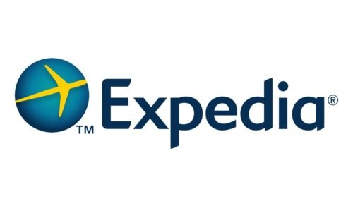
The first redesign of the logo happened only in 2007. The colors of the emblem have been elevated and brightened up, while the wordmark was shortened to just “Expedia”, and the typeface was switched to a sleeker and a more modern one with smooth lines and some angles rounded.
2010
The new logo was created in 2010, but it only stayed with the brand for several months. This is when the company tried to experiment with the color palette and removed yellow from its emblem. The stylized white plane was redrawn and now looked like a flying bird, crossing the whole blue circle. The lettering knots its type-face from the previous version but was now colored blue.
2010 – 2012
The yellow plane comes back to the logo in 2010, though the wordmark remains blue. All the shapes and compositions are the same as in the previous version, but the color shades are changed to more distinct ones.
2012 – 2021
In 2012 Expedia goes more minimalist and flat. The gradient shades are removed and now the emblem is composed of a deep blue circle with an intense yellow plane on it. The inscription is executed in the same blue color as the emblem.
2021 – 2023

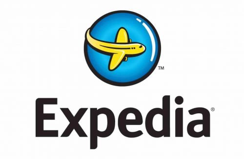
In 2021, they reshuffled the elements so that the emblem turned out directly on top of the wordmark. The coloring notably switched to a darker shade of blue, and the wordmark adopted a slightly different font.
2023 – Today
This logo features a square with rounded corners, colored in a bright yellow hue. Inside the square, there’s a bold, dark blue arrow pointing upwards to the right, accompanied by a dot, suggesting the image of a stylized plane ascending. The company name is written to the right of the icon in a clean, sans-serif font in dark blue. The initial “E” is notably stylized with a greater thickness at the bottom line.
Compared to the previous logo, this design has a more vibrant yellow background and uses a more abstract representation of the plane, which now forms part of the initial letter “E”, integrated within the yellow square, creating a more compact and modern emblem.
Font and Color
The sleek and stylish Expedia wordmark is written in a title case using a modern and smooth sans-serif typeface which is very similar to Geometric 415 Std Medium, with rounded shapes and diagonal cuts of the letter-ends, adding sharpness and individuality to the logotype.
The calm dark-blue and yellow color palette of the online travel-agency logo evokes a sense of reliability and trustworthiness, makes the customers feel comfortable while booking their trips online, and shows the company as a professional and loyal one, while the yellow accent adds a happy and joyful feeling.


