Mövenpick is an international Swiss hospitality brand, which operates 80 properties, including hotels, resorts and cruisers. Mövenpick was established in 1948 in Zurich. The brand is now owned by AccorHotels, since the 2018 acquisition of the hotel group for € 482 million.
Meaning and history
Before 2003

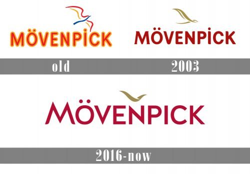
The first wordmark they had was of soft, pleasant letters colored in bright orange and outlined in yellow. Besides this assortment of tall capital letters, there was also a simplistic image of a bird made from just 5 curved lines of red, blue and yellow.
2003 – 2016

In 2003, they gave the main wordmark a deeper red color with wider letters and slightly sharper edges. Below, a small ‘Hotel & Resorts’ inscription was added in thinner red letters. The bird was transformed into a more conceptual, golden image.
2016 – Today
The Mövenpick logo is an image of a bird above the wordmark. It reflects the brand’s heritage and history. The Mövenpick founder Ueli Prager named his company after the simple, elegant movements of a seagull (in German, a ‘Möwe’), and a bird form has been a constant in the brand’s logo ever since.
The Mövenpick color palette is based on the deep red, which is closer to burgundy, for a background, white for the lettering and gold for the bird silhouette. Mövenpick corporate red color brings life to the brand and adds vibrancy.
The white wordmark is modern and clean, with the graceful lines of the bird’s wingspan above the letter N, which adds more architecture to the custom typeface.
The Mövenpick logo represents clear brand values built on its heritage, relaxed confidence and Swiss precision with extraordinary attention to details.


