Premier Inn is the brand of the British biggest hotel chain, which was established in 1987 and today had more than 800 hotels across the United Kingdom. The brand is owned by Whitbread.
Meaning and history
Premier Inn is a well-known hotel chain with hotels in many cities around the world. Premier Inn includes 800 hotels with more than 70 thousand rooms. Most of the chain’s hotels are located in the United Kingdom (only London is a home city for 30 Prier Inn hotels), although the company keeps expanding to the international market. In 2006, Premier Inn expanded beyond the British Isles by signing contracts to build hotels in India and the UAE.
Premier Inn is owned by Whitbread. Premier Inn brand appeared in 2007, after the merger of two hotel chains: Premier Lodge and Travel Inn.For a long time, Premier Inn hotels were represented in the medium-price segment. However, as demand for budget hotels grew, the owners of the chain changed the format of hotel services.
As for the history of the Premier Inn chain, the company was established in the United Kingdom in 1987, as the main competitor to Travelodge. The first name of the chain was Travel Inn, and the current name was given to it in 2004 when Whitbread company acquired the Premier Lodge brand.
What is Premier Inn?
Premier Inn is the name of a hotel chain, established in the United Kingdom at the end of the 1980s, which by today has grown into the largest company in Britain, with over 800 locations across the country. The brand, owned by Whitbread Group is considered the largest hotel chain in the UK.
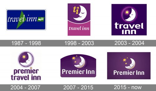
1987 – 1998

Back when they were ‘Travel Inn’, their initial logo was a blue rectangle with the company name written in small white letters across the figure’s midline. On the right from it, they’ve put a little green sign with a white bed on it. Except for it, there was also a green triangle in the background.
1998 – 2003

In 1998, they introduced the first of their moon designs. They drew a white crescent with a sleeping face on it, made from various strokes of purple. The background behind it was also purple, and, besides just the moon, there were also two yellow letters ‘T’ and ‘I’ – the latter with a little star instead of a dot.
Beneath it all, there was also a paler pink space with their name written on it in the same style as before.
2003 – 2004

Here, they put the same crescent into a purple circle, alongside a single yellow star. All of it was then placed in top of a purple square, the bottom of which was occupied by a bigger, less cursive name wordmark.
2004 – 2007

In 2004, they scrapped the purple background and repainted the wordmark below into purple. The word ‘premier’ was also added there, with a star instead of a dot in ‘I’.
2007 – 2015

The 2007 design is much like the one they adopted in 2015, but with a domed figure posing as background. The following design has a rectangle for it – a much bigger rectangle.
2015 – Today
The Premier Inn logo resembles a fairytale. It is colorful and welcoming, evoking a sense of coziness and comfort. The logo is composed of an instantly recognizable emblem with the wordmark underneath it.
The bold wordmark is executed in a rounded sans-serif custom typeface, which was created by Rob Clarke. It features sleek rounded lines and looks great in the brand’s signature purple color.
The Premier Inn emblem is a white sleeping moon and three stars, placed on a purple circle. The moon is located on the right side of the circle and its face is turned left. It is a king and relaxing image, which shows the hospitality service at its best.
The purple white and yellow color palette of the logo symbolizes calmness and relaxation, as well as the stability and purity of the company.
It is a nice and intense logo, which fully reflects the company’s profile, and make the brand stand out. The emblem is very memorable, and can’t be messed up with any other hotel’s symbol.
Font and Color
The smooth and friendly lettering from the Premier Inn official logo is set in a bold sans-serif typeface with arched contours of the characters, thick lines, and softened ends of the bars. The closest fonts to the one, used in this insignia, are, probably, Caturitta Medium or FF Signa Round Pro Condensed Bold, but with some modifications of the contours.
As for the color palette of the Premier Inn visual identity, it is based on a warm and deep shade of purple for the background, and white and yellow elements placed against it. This combination of shades evokes a feeling of coziness and comfort, showing the company as a very welcoming and friendly one.


