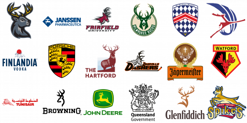
The deer is a noble and elegant animal, which is not often seen on the logos of famous brands, but still used by some companies, because the meaning, which is carried by the image of a deer – exclusively positive. It is an auspicious symbol associated with the sun, sunrise, light, purity, renewal, and rebirth. Because of the resemblance of deer antlers to the branches, the image of this animal is often associated with the Tree of Life. In addition, deer antlers symbolize the sun’s rays and fertility.
The most characteristic qualities of deer: are impetuosity, grace, and beauty. Quite a good list that many brands would like to be associated with. Moreover, the graceful body and antlers of this animal can be stylized very interestingly, which gives a huge scope for the creativity of designers.
Today we will look at the most famous logos with the image of a deer, and see how different this incredibly beautiful creature can look.
Browning
This American firearms manufacturer was founded in 1878 and today is known all over the globe. The logo of the company brilliantly reflects the heritage and expertise of the brand, evoking a sense of reliability and trustworthiness. The Browning badge is composed of a bold serif logotype, set in the uppercase of a solid geometric typeface with the first and the last letters enlarged, and a stylized contoured image of a deer head, drawn in thick black lines above the lettering. The smooth contours of the emblem balance the strictness of the lines in the logotype and create an elegant and confident badge.
Danville Dashers
Danville Dashers is the name of a professional hockey club from Illinois. The team uses a strong and stable logo, with a depiction of a deer as the main element. The Dashers’ badge is composed of two-leveled lettering, underlined by a horizontally placed hockey stick, with its bent part on the right, and a drawing of a deer in the upper left corner of the logo. The deer on this badge looks determined and powerful, drawn in profile facing to the right, it has its eye drawn in red, which elevates the fighting mood of the design.
Fairfield Stags
Fairfield Stags is the name of an athletic program from Fairfield University in Connecticut. The teams did the program not only use Stag in their names, but also a beautiful depiction of the animal as the central part of their badges. The deer here are drawn in burgundy, black and gray, and placed above two-leveled lettering in the same color palette. The image features a head of a deer drawn in profile facing to the right, with sharp anthers pointed in the same direction. The animal looks strong and ready to fight. The upper line of the inscription is set in enlarged letters in burgundy, the main color of the deer, while the bottom line is executed in bold black small capitals.
Finlandia
Finland is one of the world’s most famous brands of vodka, an beverage, which is strongly associated with cold countries. This affiliation is reflected in the visual identity of the Finnish brand. The bold blue logotype in a narrowed geometric sans-serif typeface takes most of the brand’s badge and is accompanied by a delicate emblem, placed above it. The emblem features a solid red circle of the sun, with three white silhouettes of the deers, contoured in blue. Everything here — from the color palette to the symbols on the emblem — evokes a sense of cold, snow, and ice.
Game of Thrones
One of four symbols on the logo of the famous franchise Game of Thrones is also a deer. The heads of four animals are beautifully inscribed into an ornate golden circle, which frames the rectangular badge with the gold lettering on it. Each animal represents one of the main houses from Game of Thrones, and the deer here stands for the House of Baratheon, while the Wolf is a symbol of the House of Stark, the Lion — the House of Lannister, and the Dragon — the House of Targaryen. This badge has already become iconic and is instantly recognizable in every country of the world.
Glenfiddich
The logo of the Scotch Whisky brand Glenfiddich resembles the badge of the Browning company in terms of composition but has a more elegant and sophisticated style and color palette. The head of the deer, looking up, is drawn in smooth gold lines above a narrowed title case lettering in a classy serif typeface, with the characters set in bold lines, decorated by thin sharp serifs on the ends. The deer’s head is turned to the left, with the antlers spread up and to the sides, looking graceful and powerful.
Hainan Airlines
One of the logos, used by the Chinese air carrier Hainan Airlines throughout the years also had a depiction of a deer on it. Today it is hard to imagine that the brand, strongly associated with the flower emblem, could have its planes decorated by an image of a forest animal, although it did. The badge featured a stylized red silhouette of a deer leaping to the right and crossing a blue vertically oriented swoosh-like element, composed of three fragments. It looked very modern and cool, especially due to the powerful color palette.
Hartford Insurance
Hartford is a large American company, engaged in financial and insurance segments. The company’s badge is set in a chic and elegant burgundy and light-blue color palette, with the massive stylized image of a deer, standing on a hill in the upper right corner of the composition. The graceful animal here looks solid and confident, which transmits the same feelings to the whole logo, showing the company as a reliable and serious one. Drawn in burgundy, the image of a deer is supported by bold uppercase lettering in the same color, executed in a clean geometric sans-serif typeface.
Iowa Heartlanders
The visual identity of Iowa Heartlanders, a professional ice-hockey club from the American minor league, has the image of a deer as its only element. The animal’s head is drawn in thick smooth lines of black and gray colors, with thin bright-yellow accents on the antlers of the animal. The head is turned to the right, looking into the future and showing the mood and character of the club, which is ready to fight, win and move forward. The badge has no additional lettering on it, with all the meanings the club wanted to transmit out to the deer, and it works.
Jägermeister
A famous herbal digestive from Germany, Jagermeister, has always had a deer on its badge too. The name of the brand is translated from German as “Master Hunter” of “The Hunt Master”, and the depiction of a deer on its logo has a beautiful legend. First of all, we have to mention, that the concept of the badge is taken from the crest of Saint Hubertus, hence the legend is connected to it. One day Hubert went hunting and saw a graceful stag. The animal was running from him, but then stopped, turned around and Hubert saw a crucifix standing between its antlers. On the Jagermeister logo, the deer and the cross are drawn on a circular medallion above gothic-style lettering.
Janssen
Janssen is one of the largest pharmaceutical companies in Europe, which is headquartered in Belgium and owned by Johnson & Johnson. For many years the company has been using an image of a deer as the main symbol of its emblem. The previous logo featured a white silhouette of an animal drawn in thick strict lines over a solid blue rhombus, while the current badge depicts a modern stylized image of the animal, formed by two fragments in gradient blue. The emblem is accompanied by a lowercase blue logotype in a fancy custom sans-serif typeface with smooth lines and sophisticated contours.
John Deere
John Deere is an American manufacturer of agricultural machinery, which also has a deer on its logo. Here it is more than logical, as the surname of the company ‘a founder, which is also the name of the company itself, sounds just like the animal. The badge, set in a green and yellow color palette, is composed of two parts: bold green lettering in the uppercase of an extended geometric sans-serif typeface, with the “J” and the “D” enlarged, and a square badge with arched sides, placed above it. The gradient green banner depicts a yellow silhouette of a deer, running to the left. The color of the animal is supported by the yellow internal framing of the emblem.
Milwaukee Bucks
The visual identity of one of the NBA clubs, the Milwaukee Bucks, is also based on a drawing with the deer’s head. The circular badge in beige and moss-green has an image of an animal set in its upper part, above the arched green ribbon with the team’s name written on it in narrowed capitals. The deer is drawn in a geometric minimalistic manner, with solid green elements complemented by white details. The animal looks strong and even a bit aggressive, showing the fighting spirit of the professional basketball club, and their willingness to win.
Porsche
On the badge of the iconic German car marque Porsche, we can see not a deer itself, but its antlers. Two yellow fragments of the Porsche crest, feature a depiction of three black antlers on each. These animals on the heraldic logo of the brand represent Wurttemberg’s coat of arms and the dukedom from the XV century. These elements also brilliantly balance the elegant sharp lines of the main element in the badge, the black stallion, placed in the center of the composition. The yellow fragments of the crest are accompanied by two red and black ones, which are also taken from the same coat of arms.
Queensland Government
The government of one of the Australian states, Queensland, has two main animals on its official crest — the brolga and the red deer. These symbols were granted to the state by Queen Elizabeth II in 1977. The brings is one of the most common birds in Queensland, so there is no surprise it is depicted on the logo of the state. As for the deer, it is here to symbolize the old world and show the connection of Australia to Great Britain. Two animals are placed on the sides of a traditional coat of arms, which is decorated by two ornate ribbons on top, and bold sans-serif lettering at the bottom.
SSC
The logo of the American automaker SSC, established at the end of the 1990s as a subsidiary of Shelby Motors, has a very small depiction of the deer’s head in the bottom part of its bright white and blue crest. The delicate yellow image is not always even noticed. Placed on a solid blue part of a sleek shield with a rhomboid pattern and a red and white Chevron in the center, the yellow head of a stag is not only a color accent but also a representation of the excellence and reliability of the brand.
State College Spikes
State College Spikes are the name of an intercollegiate baseball club from the United States, which also uses an image of a deer in its visual identity. The animal here is drawn in smooth solid lines in two shades of beige, which give a more realistic look to an animal, executed more in a cartoonish manner. The image is outlined in navy blue, which is supported by the outline of two other animals on the logo — a red ribbon with the yellow “State College” inscription written on it in slanted rounded capitals of a bold sans-serif typeface, and a stylized “Spikes”, executed in two shades of beige with the two “S” enlarged and drawn in a wishbone style with sharp details.
Tunisair
Tunisair is the National air carrier of Tunisia, which was established in 1948, and has a stylized image of a deer on its badge. The animal here is drawn in red horizontal stripes of different lengths and thicknesses and placed against a white background on the left from the two-leveled inscription, also set in red. The striped pattern of the emblem adds a sense of speed and motion and makes the elegant contour of the deers even more sophisticated and chic. As for the color palette, it was a truly right choice, as it elevates the feeling of strength, confidence, and excellence, evoked by the composition.
Watford
Watford is the name of a professional football club from Great Britain, which competes in the second-tier league. The logo of the club is executed in an intense and even aggressive color palette, composed of black, yellow, and red, with a stylized image of a deer’s head drawn in its center in solid red. The head is outlined in black and set on a sharp geometric crest with the left half colored black, and the right — in yellow. The crest is accompanied by a horizontally-oriented rectangular banner with a simple sans-serif inscription, attached to the top border of the shield.


