The football team was established in 1881 under the name of Watford Rovers. It made its debut in the FA Cup in 1886.
Watford fans can now use bitcoin to purchase club merchandise, it has been announced.
Meaning and history
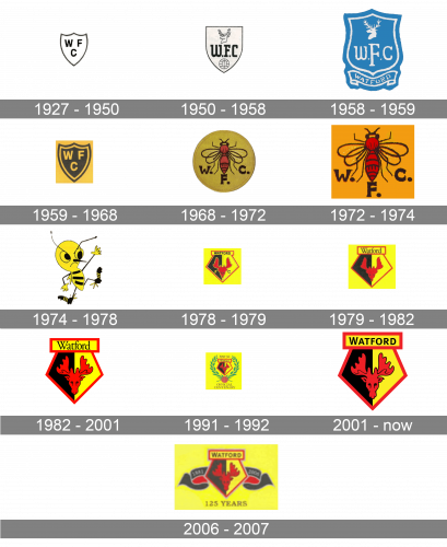
Most badges of the Watford Football Club have been inspired by the crest of its home city, Watford, Hertfordshire, England. In the course of time, the club developed a unique and distinctive logo.
1927 – 1950
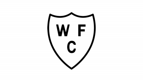
One of the first Watford FC badges was created in 1927 and stayed with the club for almost two decades. It was a plain and modest crest in a monochrome color palette, with just three black letters “WFC” in a bold and rounded sans-serif typeface” placed on a white background of a traditional crest outlined in black. The simplicity and neatness of this badge made it suitable for almost any background and occasion.
1950 – 1958
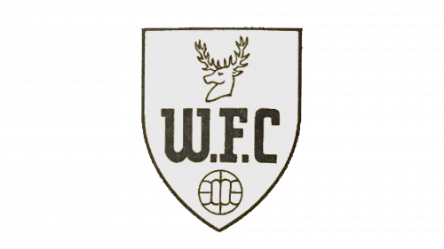
The redesign of 1950 added a few graphical symbols to the modest black-and-white crest of the football club. The shield itself got its contours straightened and refined, and the lettering was now set in one line, with the square dots separating the bold letters in a fancy custom typeface. Above the monogram, there was a contoured wad of a deer drawn. The animal was facing left. Another element was set under the inscription, it was a delicately contoured football executed in the same black and white color palette.
1958 – 1959
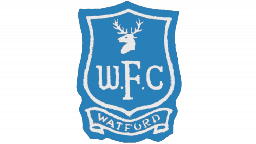
The color palette of the Watford FC visual identity was switched to blue and white in 1958. However, the new badge only stayed with the club for less than one year. It was a contoured classy crest in white set on a blue background. With the white deer head, stylized monogram with the central “F” stretched vertically, and a fancy smooth ribbon with the complete “Watford” inscription in the uppercase, placed under the crest, also in white and on a blue background. The football image was removed from this logo version.
1959 – 1968
The laconic original version of the Watford badge was adopted for the club’s primary visual identity again in 1959. It was a shield in a double gray and yellow outline with three bold sans serif letters placed on the black background. The “WF” was set above the “C”, and all letters featured the same style and size. The badge was normally placed on a dark yellow background, just the same shade as the outline and the lettering on the emblem.
1968 – 1972
The 1968 Watford FC logo sported a completely different visual metaphor. It was based on the club’s nickname, the Hornets. The roundel badge featured a hornet above the letters “WFC.” On the 1974 logo, an anthropomorphized hornet could be seen.
1972 – 1974
The bee logo of the Watford Football Club was redesigned in 1972. It was now a rectangular, not circular, badge, with the background yellow darkened up and becoming fire of an orange shade. The bee itself was also refined and got all of its elements darker and sharper. The “W. F. C.” Inscription was still there, in the same custom extra-bold serif font and same plain black color, standing for strength, confidence, and professionalism, while the mascot insect was there to symbolize the hardworking approach and determination of the club’s players.
1974 – 1978
On the 1974 logo, an anthropomorphized hornet could be seen.
1978 – 1979
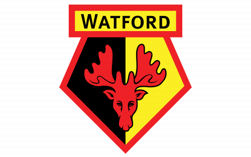
In 1978, a new era started in the history of the logo. The emblem featured the head of a red deer inside a stylized shield divided into two fields, red and black. The word “Watford” was placed above.
1979 – 1982
The colorful deer badge was redesigned in 1979. The contours were cleaned and all the extra details were now removed. The “FC” lettering was gone from the badge, while the main “Watford” inscription changed its typeface to an elegant serif one, and was now set not in all caps but the Titlecase. The double black and yellow outline of the deer’s head was also gone, and the red mascot image got enlarged and started looking more powerful and dangerous now.
1982 – 2001
The redesign of 1982 refined all of the Watford visual identity elements and drew them in a more professional and modern way, with clean and strong contours. The style of the inscription wasn’t changed at all, neither was the color palette of the logo, but the deer’s head, the central element of the badge, was redrawn in a smooth and classy manner.
1991 – 1992
For the 100th anniversary of the club, the new logo was created in 1991. The iconic red yellow and black badge with the deer image was placed on a bright yellow square and enclosed into massive green wrath with the “1991 — 92” datemark placed on top of it, right above the rectangular banner with the logotype. On the bottom point of the wrath, under the crest, there was a warm-brown image of a football, and under the ball, the additional uppercase “Official Centenary” inscription in a lightweight and elegant serif typeface.
2001 – Today
 The current emblem, which was introduced in 2001, looks almost exactly the same, except for the lettering: the font is simpler, the text has been capitalized.
2006 – 2007
This was a one-off emblem for the club’s 125th anniversary. It’s the same as the previous design, but with a few additions: the black ribbons bearing the years ‘1881’ & ‘2006’, the yellow background and the ‘125 years’ inscription written in strict serif letters below.
Colors
The current color scheme of both the Watford logo and uniform includes three colors: black, yellow, and red. The first time the team wore a yellow and black uniform was in 1959 (black shorts and yellow shirts). Red made its debut in 1973 due to a recommendation of the club’s manager Mike Keen.
Watford Colors
YELLOW
HEX COLOR: #FBEE23;
RGB(251,238,35)
HSL(56, 100%, 50%)
CMYK: (3,2,98,0)
RED
HEX COLOR: #ED2127;
RGB(237,33,39)
HSL(357,93,89)
CMYK: (4,100,100,0)
BLACK
HEX COLOR: #11210C;
RGB(18,17,12)
HSL(49,32%,7%)
CMYK: (71,66,69,83)


