John Deere is a large company and one of the world’s most famous manufacturers of farming and agrarian machinery, which was established in the United States in 1837 and named after its founder. Today the American company operates across the globe providing its individual and commercial clients with various machinery and engines, as well as financial services in the agricultural sector. The public company is run by John C. May and has a yearly revenue of about 40 billion USD.
Meaning and history
John Deer is a trademark of Deere & Company, a well-known American manufacturer of diesel engines, as well as a variety of special equipment designed for construction, agriculture, landscaping, and logging. The company is focused on the production of a wide range of products for the needs of farmers, builders, loggers, and gardeners.
The history of John Deere goes back to the 19th century during the colonization of the American Midwest.
The founder of the company John Deere was born in 1804 in Vermont, where he worked from 1825 as an apprentice in a blacksmith shop. The young John Deere became a true master of his trade, making excellent shovels and forks.
After moving to Illinois, John opens his blacksmith shop, where he continued to improve his skills, and by 1837 John Deere had invented the steel plow for working sticky soils. By 1848 Deere was producing about a thousand similar implements a year.
The company grew successfully, and in 1868 it was incorporated as a corporation. John Deere’s son Charles Deere became its vice president. By steadily expanding production and its network of independent dealers, John Deere has grown into a manufacturer of a wide range of agricultural equipment.
Today Deere & Company Corporation is one of the Fortune 100 largest industrial companies. John Deere products are sold in 130 countries worldwide. The company is constantly expanding its presence. John Deere plants are located in Europe, Asia, and North and South America.
What is John Deere?
John Deere is the name of one of the world’s leaders in the production of agricultural machinery and equipment. The company was established in 1837 in the United States, and today operates all over the globe, distributing its products to all continents.
1876
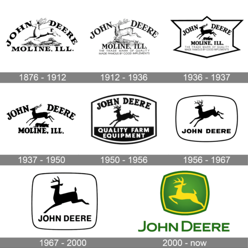
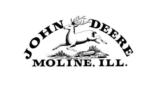
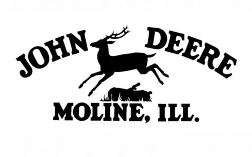
While the original John Deere logo was officially registered in 1876, it had been in use for three years by then (according to registration papers). The design featured a deer bounding over a log.
Below the deer, there was the lettering “Moline, ILL.” In addition to the factory location, these words were necessary because the plows produced by John Deere were commonly referred to as “Moline plows.”
1912
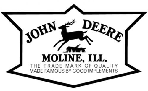
While the overall design remained pretty much the same, a lot of details were redrawn. The long slogan starting with the words “The Trade Mark of Quality” appeared for the first time.
1936
The brand’s standardization committee recommended modifying the logo to make it easier to reproduce on the products. As a result, the deer became simpler and more minimalistic. Yet, the 12-sided border that appeared around it only made the design more cluttered.
1937
The border disappeared as did “The Trade Mark of Quality” slogan. The reason why the logo was simplified could be that this was the year when John Deere widened its range of products. So, an easy-to-reproduce emblem was necessary. Another possible reason could be that 1937 was the year of the company’s 100th anniversary.
1950
The log disappeared, while the deer’s outline was redrawn.
1956
The design was further simplified by removing the slogan.
1968
Both the deer and the type grew more minimalistic.
2000
After a few more minor modifications, the logo took its current shape in 2000.
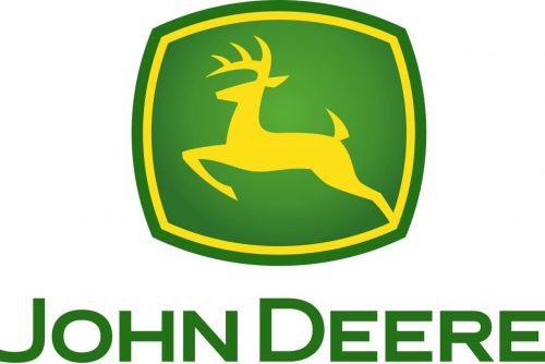
Today, the John Deere logo is a green curvilinear rectangle with a yellow inner lining. The deer is yellow too, and it has a more streamlined shape.
Symbol Logo
The John Deere logo pretty much reflects the company’s eternal rush for perfection and prosperity.
Emblem Logo
The combination of green and yellow creates a feeling of warmth and satiety, and it reflects the company’s mission – providing tools helping us to keep our dinner table laid.
Font and Color
The brutal and modern uppercase lettering from the primary John Deere badge is set in a distinctive sans-serif with slightly extended letters. The closest fonts to the one, used in this insignia, are, probably, Syncopate Pro Bold or Organetto Bold Semi Ext but with significant modifications of some letters.
As for the color palette of the John Deere visual identity, it is based on a combination of two intense shades, green and yellow; which first of all represent the specialization of the company, and agriculture, and evoke a sense of growth, success, and energy.
What does the John Deere logo mean?
The green and yellow logo of John Deere is composed of bold geometric uppercase lettering and a solid green emblem with a yellow deer drawn on it, symbolizing the name of the brand, and reflecting such qualities as motion, strength, determination, and innovative approach.
What does the John Deere logo look like?
The John Deere logo is a simple yet confident composition, formed by stable geometric lettering in a bold sans-serif typeface, and a square emblem with the sides arched from the center. The green badge features a yellow image of a deer, which is supported by a thick yellow outline.
Who created the John Deere logo?
The current John Deere logo, introduced in 2000, and its main difference from all the previous versions are in the deer itself. Before, all the badges featured an image of a landing deer, and the latest version shows it leaping, jumping higher, symbolizing progress and development meant. This badge was designed by Todd True from the famous Landor agency.
Can I use the John Deere logo?
John Deere logo is a registered trademark, which is copyrighted, and the company is the copyright holder. Hence, to use the John Deere badge you need to get official permission from the company. Afterward, you have to follow all the guidelines of the brand, for the perfect presentation of the badge on your website or document.


