

![]() Game of Thrones Logo PNG
Game of Thrones Logo PNG
Game of Thrones is one of the most popular fantasy tv-shows, created in 2011 in the United States. The series is based on the first of George Martin’s novels, which had the same name. There were 8 seasons and 73 episodes of Game of Thrones released from 2011 to 2019.
Meaning and history
![]()
The Hame of Thrones logo is probably one of the most recognizable tv-series visual identities ever created.
Composed of o wordmark, which is often used on its own in black or silver, the logo sometimes created an ornate emblem, with a rich symbolism, placed on the background.
The Game of Thrones nameplate is executed in a classic Trajan Pro typeface, which replicates the original Roman letters. The wordmark is perfectly balanced and looks elegant and strong. The two unique detail of the Game of Thrones inscription is its letter “O”, which has three thin vertical lines inside, and the elongated horizontal bar of the letter “T”, which finished after the “S” of “Thrones”.
What is Game of Thrones?
Game of Thrones is the name of one of the most popular tv shows in history, which was introduced at the beginning of the 2010s, and created based on the novels of George Martin, an American writer. The TV show represents the fantasy genre and has 8 seasons of more than 70 episodes released.
The Game of Thrones nameplate is written in all the capital letters, with “G” and “T” enlarged, and the “Of” part reduced.
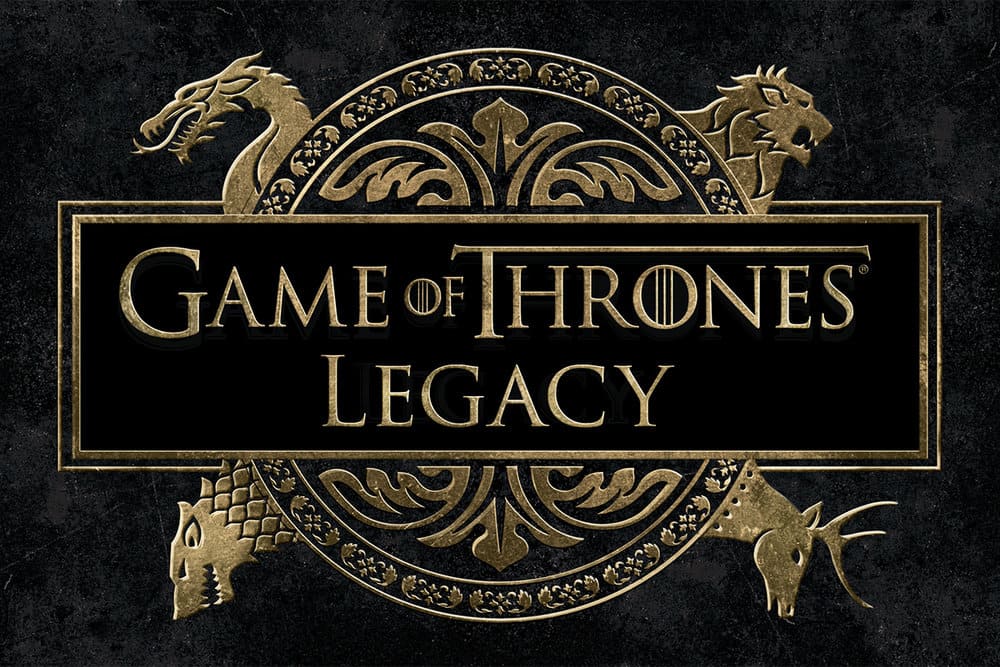
The Game of Thrones emblem is an ornate circular badge placed on a horizontally located rectangle. The four animals’ heads come out of the circle in four different directions.
Each animal is a symbol of one of the legendary houses: Wolf — House Stark, Lion — House Lannister, Dragon — House Targaryen and Deer — House Baratheon.
Font and Color
 The extremely elegant and sophisticated lettering from the primary badge of Game of Thrones is set in a classy serif font with some interesting delicate details on the ends of the bars. The closest fonts to the one, used in this insignia, are, probably, Trajan Regular, or Cal Roman Capitals, but with the letters “O” modified.
As for the color palette of the Game of Thrones visual identity, it is based on a simple yet powerful plain black, with all elements placed against a white background. The monochrome color scheme elevates the elegance of the badge to the tops, making up a chic and timeless image, with the distinctive contours of the letters clearly visible.


