

![]() Missouri Tigers Logo PNG
Missouri Tigers Logo PNG
In this article, we will follow the evolution of the athletic logo of the University of Missouri located in Columbia over the last couple of decades.
Meaning and history
![]()
The Missouri Tigers football team, also called “Mizzou”, represented the institution in the Big 12 Conference until the 2012 – 2013 season. The team’s most recent appearance in the NCAA Division I men’s basketball tournament was in 2023. The name is derived from the War Tigers of Columbia, who protected Columbia from Confederate guerrillas during the American Civil War in the 1800s.
What is Missouri Tigers?
Missouri Tigers is the moniker for the University of Missouri’s athletic teams in Columbia, Missouri. Competing in the NCAA Division I, they are esteemed members of the Southeastern Conference (SEC). Renowned for their broad spectrum of athletic triumphs, the Tigers hold a prestigious spot in the realm of collegiate sports, reflecting a history rich with competitive spirit and achievements.
1980 – 1995
![]()
A very realistic picture of a jumping tiger with an open mouth and alert emotion instantly caught the attention when looking at the Mizzou logo. The name was printed in just as bold a manner using thick strokes, slab serifs, and all uppercase letters. The font looked similar to Zennat Pro One.
1995 – 1999
![]()
Although this logo does not feature a scary jumping tiger, it left a footprint in the clubs. A black footprint with a fuzzy edge served as the base in this version. In the center, it had a large initial. The “M” was printed in yellow and using the same font seen in the previous emblem, which linked the two logos and provided recognition.
1999 – 2014
![]()
While the previous Missouri Tigers logo, which was introduced in 1995, was purely typographic, the current one conjures up more emotions due to the fact it depicts a living creature, the tiger.
The old logo was based on a big, heavy “M.” The letter given in black with thin yellow trim belonged to an old-fashioned slab serif type.
2014 – 2016
![]()
A dashing, fearless profile of a tiger from the last logo became the only element of the emblem. It was placed on a black oval base with a thin brown and black border. The animal’s ears and bottom jaw slightly covered the border, which made it appear as if the wild cat is jumping out. It symbolized the unrestricted power of this wild beast and the determination of the team to win every single game.
2016 – 2018
![]()
There was no big change done in 2016 and only loyal fans probably saw the difference. The team simply made the light brown color look more like orange than brown. This made the logo lighter and created more contrast between all the details.
2018 – Today
![]()
Only a year later, the updated Missouri Tigers logo was introduced. While it has preserved the color scheme of its predecessor, the emblem itself is utterly different in its style and mood. You can see an ellipse housing a stylized tiger’s head. The creature looks fierce due to the sharp fangs and the expression of the muzzle.
Missouri Tigers baseball
![]()
The University of Missouri has a pretty successful baseball team that became the NCAA Tournament champions in 1954. We should point out, though, their most successful period has taken place in the 1950s and the 1960s. And yet, several of their 22 NCAA Tournament appearances took place in the 2000s. As of 2019, the latest of them was in 2012.
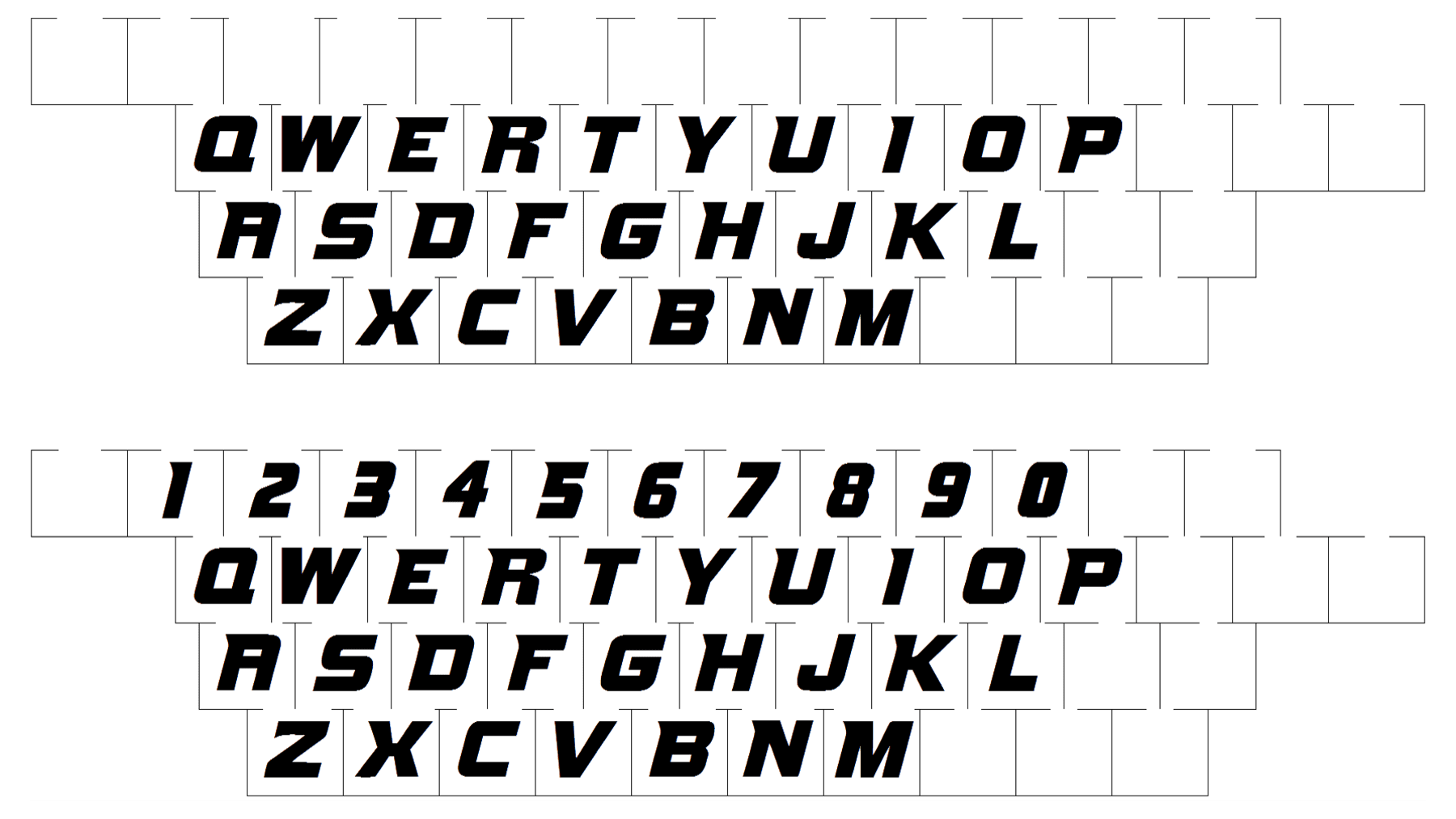
Font
Missouri Tigers Colors
BLACK
PANTONE: PROCESS BLACK
HEX COLOR: #000000;
RGB: (0,0,0)
GOLD
PANTONE: PMS 124
HEX COLOR: #F1B82D;
RGB: (241,184,45)
CMYK: (0,25,90,5)


