 Minor League Baseball Logo PNG
Minor League Baseball (MiLB), a subsidiary of Major League Baseball (MLB), operates under the ownership and oversight of MLB. This vast network of minor league teams, essential in nurturing and developing talent for the major leagues, showcases a rich tapestry of teams across the United States and Canada. In its operational landscape, MiLB spans multiple levels, from Rookie leagues to Triple-A, each serving as a crucible for honing the skills of aspiring baseball professionals.
Meaning and history
Founded in 1901, Minor League Baseball initially emerged as a collective of independent baseball leagues, eventually becoming the structured system we recognize today. Its foundation was pivotal in standardizing and organizing professional baseball below the major league level. Throughout its history, MiLB has been instrumental in cultivating some of baseball’s greatest talents, serving as a proving ground for players, coaches, and officials. Achievements of MiLB include its role in the integration of baseball, the development of future Hall of Famers, and its expansion to over 200 teams. Presently, MiLB stands as an indispensable component of professional baseball, a nursery of talent and a beloved aspect of American sports culture, continuing to evolve and adapt to the changing landscapes of sports and entertainment.
What is Minor League Baseball?
Minor League Baseball is a professional baseball organization, a subsidiary of Major League Baseball, dedicated to developing players, coaches, and officials for major league competition. It’s a network that spans across North America, serving as both a training ground for future MLB stars and a beloved source of local sports entertainment.
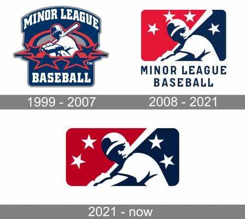
1999 – 2007

The 1999 logo was a tall square shape with a wider dome for the top. That’s where they put the words ‘Minor League’, while ‘Baseball’ was accommodated in the very bottom. The font was the same college style with blocky serifs, except the former part was also curved. The space between them was taken by an image of a baseball player (stomach up) with four big stars beneath. The main colors were white, blue and red.
2008 – 2021

The 2008 logo uses the same image of a player, except this time it was largely white and placed in the middle of a wide rectangle. The picture divided the shape in two halves: dark blue on the right, red on the left. Except for that, there were also four white stars above. Unlike before, these weren’t tilted backwards. Beneath the logo, they’ve written the words ‘Minor League Baseball’ in slimmer, blue letters.
2021 – Today

On the one hand, the logo of Minor League Baseball (MiLB) depicts the same objects as that of Major League. And yet, it gives them from a somewhat different perspective. So, although the MiLB logo echoes the emblem of the senior organization, it has a distinctive look.
Both the logos showcase a baseball player ready for a pitch. However, on the Minor League Baseball logo, the player is given with much more detail, it’s not just an outline. Also, you can see four stars above his head, while there’re no stars on the Major League emblem.


