Microcar is the name of a French company, which was established in 1984 by a famous group, specialized in yachts and boat production. The sub-brand was founded with the idea of creating super-compact cars. In 2008 the business was sold to Ligier in order to form one of the largest European companies, focused on the design and production of small cars.
Meaning and history
Microcar, a French microcar manufacturer, was founded in 1984 as a division of the Bénéteau group, a major manufacturer of sailing boats and yachts. In September 2000, production moved to a new custom-built factory. In September 2008 Microcar was acquired by Ligier Automobiles in a deal backed by Italian private equity firm Investimenti Partners.
The merger created Europe’s second-largest microcar manufacturer and the largest manufacturer of quad bikes, or vehicles which do not require a license.
What is Microcar?
Microcar is a brand of low-budget cars, produced by the French company, established in the middle of the 1980s. Originally, the company was engaged in the production of boats, but switched to manufacturing small cars in 2008, after it was acquired by Ligier.
1984 – 2011

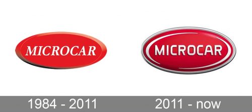
The first badge was designed for Microcar in 1984 and stayed unchanged for many years. It was a very simple and even slightly naive concept with an italicized uppercase inscription in white set on a horizontally stretched oval in scarlet-red. The edges of the badge got some gradient shades, which made it look voluminous and thick. As for the lettering, it was executed in the simplest serif typeface, without any custom or modern elements.
2011 – Today
The Microcar visual identity has had several redesigns during its history, but all of the versions have been more or less the same, as the recognizable style of the brand was formed in the very beginning.
The logo of the compact-cars manufacturer is composed of a horizontally located oval with a delicate silver outline in the center of the red oval there is a “Microcar” wordmark in all capitals, executed in a custom geometric sans-serif typeface with clean lines and interesting contours of the letters, adding a slightly futuristic mood to the badge.
The emblem is also complemented with two curved silver lines, placed along the oval’s perimeter, resembling an orbit, which also correlated with the theme of future and space. This is how the brand shows its progressive approach to design and ecology.
When placed on the cars, the emblem is made three-dimensional, with its glossy red surface and delicate silver elements, it looks like a bright candy on the bonnet of a tiny stylish car.
Font and Color
The bold and smooth uppercase lettering from the primary Microcar badge is set in a custom sans-serif typeface with rounded angles and straight cuts of the bars’ ends. The closest fonts to the one, used in this insignia, are, probably, Gia Black, or Charles Wright 1935, but with the contours of most letters modernized.
As for the color palette of the Microcar visual identity, it is based on a combination of red and silver, with a glossy surface and some sparkly gradients, making the badge look like Candy. The contrast between red and silver creates an image of a confident and strong company, which values the comfort of its customers and their safety.


