

![]() LVMH Logo PNG
LVMH Logo PNG
LVMH is a short name for Louis Vuitton Moët Hennessy Group, which is the world’s most famous distributor of luxury fashion, cosmetics, and beverage products. The company was established in 1987 in France and today it operates worldwide, with its name synonymous to High-Class Goods.
Meaning and history
![]()
LVMH is definitely one of the most famous and respected distributing companies in the world’s luxury segment. It is the name, which people across the globe know to be connected with all the latest trends, fanciest occasions, and iconic brands. Whether it is a fashion or cosmetic label, it is also associated with top class, celebrities, and extreme elegance.
The LVMH visual identity has always been based on an elegant inscription, which doesn’t need any graphics to look classy and chic. The first version of the wordmark was complemented by a massive tagline, which was removed after the redesign of 2010.
1987 – 2010
![]()
The very first version of the logo was introduced in 1987 and boasted a two-leveled inscription executed gray and dark green, and separated by a long gray horizontal line.
The upper level of the logo, in gray, comprised the “LVMH” lettering in a traditional yet sleek serif typeface, which is very similar to such fonts as Argus RR Light and Sydney Serial Light. As for the bottom line of the logo, consisting of “Moët Hennessy Louis Vuitton” inscription, it was written in a light and extended sans-serif typeface, close to Gill Sans and P22 Platten Neu fonts.
The gray and green combination of colors evokes a sense of calmness and authority, showing the company as an exclusive and exquisite one.
2010 – Today
![]()
The redesign of 2010 simplified the LVMH logo to just one wordmark, which still can be complemented by a tagline, deciphering the abbreviation, but for only special occasions. The “LVMH” logotype from the 2010s boasts sleek old-style lettering with clean bold lines and sharp serifs, looking elegant and sophisticated.
Brands under LMVH
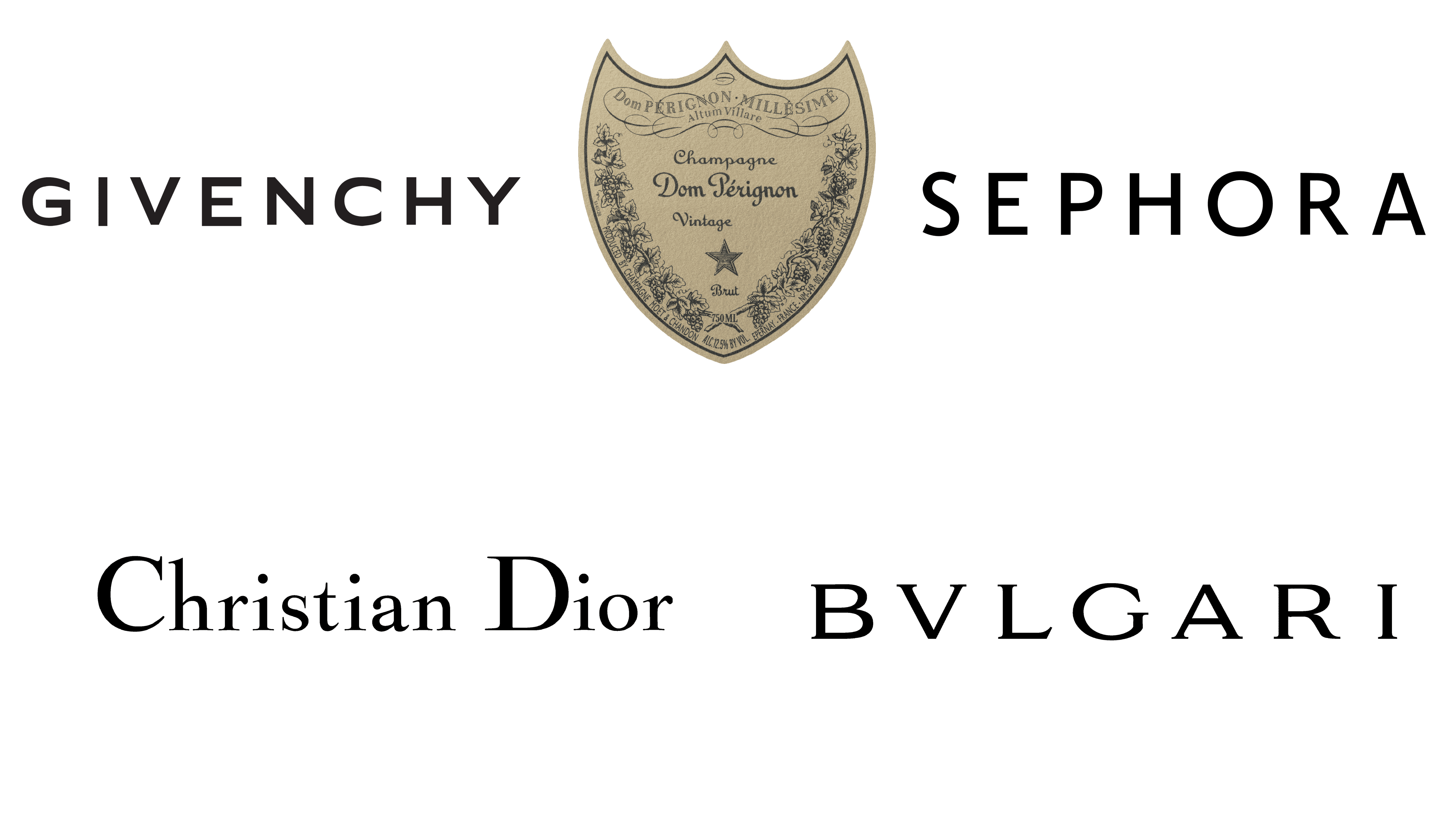
There are six main companies, owned by the LMVH conglomerate. They include Dom Perignon, Dior, Givechy, Bulgari & Sephora.
![]()
Dom Perignon is a French company that produces alcohol, including many wine marques. They include 26 further brands of this sort. The company was established in 1921. Their current logo looks like their own name, written in a signature-like, elegant style. Beneath them, there is a small 3-tipped shield, a sign of quality.
![]()
Christian Dior is a French fashion company, established in 1946. The brand itself commonly sells luxury clothes, but their operation also includes 17 other clothing, accessory and footwear brands. Their logo is just the word ‘Dior’, written in a strict, but pretty simple serif style with miniscule serifs.
![]()
Givenchy is a high-class producer of perfume and cosmetics. In addition to their own brand, they own 13 other brands, most related to cosmetology and fragrance-making. The brand’s logo depicts the word ‘Givenchy’, written in all capital letters. They are all bold sans-serif characters with big gaps between them.
![]()
Bulgari is an Italian brand of high-class accessories, jewelry, watches and so forth. It was established in 1884, the house is owned by LVMH since 2011. The emblem they use depicts their own name (styled as ‘BVLGARI’). These capitalized letters use sharp, miniscule serifs. They are also placed some distance away from one another.
![]()
Sephora is a retailer of cosmetics, skincare, haircare and other beauty products from France. They operate since 1970, as a subsidiary of LVMH since 1997. Their logo is a collection of basic, bold sans-serif letters. They are all capitalized and black. The gaps between the characters are slightly bigger than usual, but all pretty typical overall.
Font and color
The company has been very consistent with its visual identity, so the switch of the typefaces after the redesign of 2010 was very delicate and not dramatic at all. The current wordmark in all capitals is executed in a classy and timeless serif typeface, which is mercy much alike to Dutch 801 Std Headline and Times New Roman OS Regular fonts. As for the tagline, when it is used by the brand, it is written in the same clean and light sans-serif as on the previous version.
The new color palette of the company’s visual identity is based on a combination of black and white, which is the most logical choice for any brand, working with different labels. This traditional and elegant palette represents the company at its best, pointing on high-class, professionalism, and value of style and beauty.


