 Lehigh Valley Phantoms Logo PNG
The ice hockey team Lehigh Valley Phantoms, which plays in the AHL, is the top minor league affiliate for the Philadelphia Flyers club, which belongs to the National Hockey League.
Meaning and history
The Lehigh Valley Phantoms logo definitely has an eerie feel about it. The orange eyes staring from the dark are placed inside a variation of a shield shape with the name of the team positioned above.
1997 — 2009
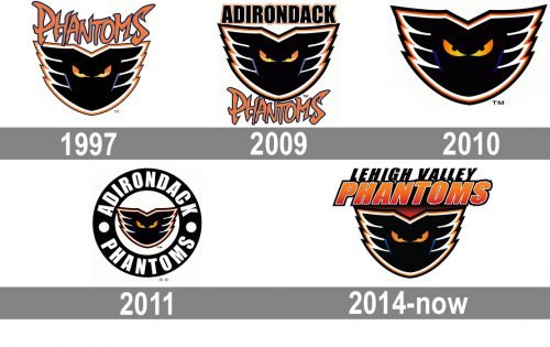
Once created, in 1997, the Phantoms emblem has never been changed, only placed into different environments. The very first version featured a black phantom face with orange eyes set under the stylized orange wordmark, executed in smooth bold lines with elongated and sharpened tails.
2009 — 2010
The redesign of 2009 placed the “Phantoms” inscription under the graphical part and added the “Adirondack” lettering to its upper part. The new wordmark was executed in a bold sans-serif typeface with black massive letters outlined in orange and white and glue to each other.
2010 — 2011
The contours of the phantom were refined and cleaned in 2010 and all the lettering was removed from the club’s visual identity. It was a minimalist yet sharp and stylish badge, built around a single element.
2011 — 2014
In 2011 the phantom face was placed on a white background and enclosed into a thick black circular frame with the bold white lettering set around its perimeter and two solid white dots separating two words from each other.
2014 — Today
In 2014 the phantom emblem got placed on a gradient red background and accompanied by a refined wordmark, placed above it. The new inscription is written on two levels and has its “Phantom” part ExtraBold and italicized, executed in bright orange, while the “Lehigh Valley” is written in simple black sans-serif.
Colors
The electric blue and black elements of the logo create a striking and somewhat supernatural contrast with the orange letters. White is added to further enhance the contrast. There’re basically only five colors, yet orange is used in a variety of shades.


