The baseball team which is currently known as the Lancaster Jethawks originated in 1947 in Reno as the Silver Sox. Then there followed the Reno Padres, the Riverside Pilots, and at last the name Jethawks came into use in 1996. The Lancaster-based team (California) owes its named to the city’s aerospace industry.
Meaning and history
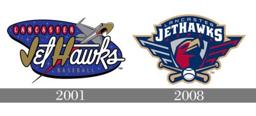
The 2001 logo shows a jet with a characteristic hawk head and the team’s name with the word “JetHawks” written in a retro style. The jet is flying up in the night sky.
2001 — 2007
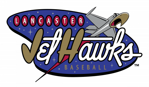
The very first logo of the Lancaster Jethawks club was introduced in 2001. It was a bright and futuristic badge with a blue started background, and a spaceship above the main wordmark, which was written in rounded letters of a custom font, in white, with two letters, “J” and “H” enlarged and colored in calm gold. Above the large wordmark, there was a “Lancaster” inscription with white sans-serif letters placed on red vertically oriented ovals in black outlines. The thin gold “Baseball” tagline was written in a classic sans-serif, completing the image.
2008 — Today
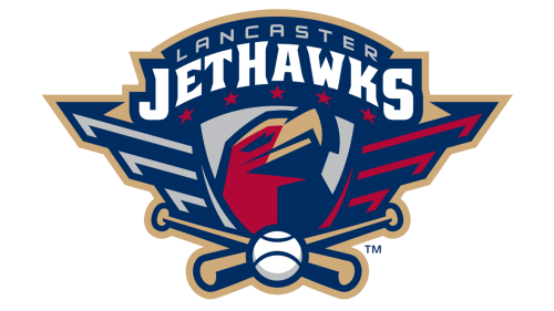
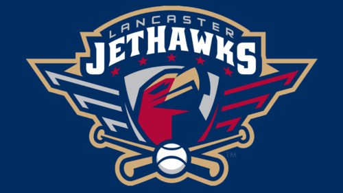
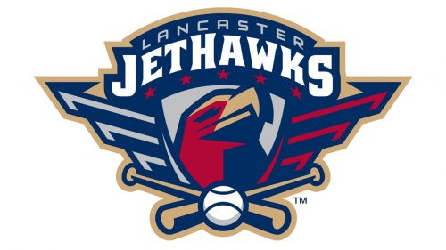 The Lancaster Jethawks’ current look took shape in 2007-2008. Now their team identity features a hawk’s head in brick red color. On the sides there are military-style wings against a navy blue background. The whole thing looks like both a bird with its wings spread and a US Air Force badge. There are five stars above the hawk’s head to symbolize the highest rank. The team’s name is written on the top in an arch. Two crossed bats with a baseball in the center are below. The logo is outlined in silver.


