

![]() KTM Logo PNG
KTM Logo PNG
KTM is a brand of sport and off-road motorcycles, established in Austria in the 1930s. The company is considered to be one of the largest European manufacturers in its industry and its name is highly recognizable all over the world.
Meaning and history
![]()
The brand’s name KTM is an abbreviation of the company’s founders’ names — Kronreif Trunkenpolz Mattighofen. The company became famous as the first manufacturer of four-engine motorcycle models with an air cooling system. And until today KTM is one of the greatest Europeans brands in its sector.
The KTM logo has been redesigned several times during its history, but it always featured the brand’s nameplate as the main element.
1953 – 1954
![]()
The first KTM logo was not official and featured a detailed picture of a tiger walking through a ring with the “KTM” lettering on its top. The orange and black color palette celebrated the brand’s energy and passion.
1954 – 1958
![]()
In 1954 KTM gets an official logo, which is composed of a bright orange oval with blue wordmark on it and a swoosh symbol as an underline. The logo is eye-catching due to its color palette and vivid because of the playful lines of the lettering.
1958 – 1962
![]()
In 1958 the brand creates a new logo concept — it is a minimalist monochrome emblem with strict and slightly italicized lettering. The outline of the oval is black. The logo became a starting point for all the future brand’s visual identity redesigns.
1962 – 1978
![]()
The official KTM logo of this time period features a new color scheme — light blue background with white lettering. It is fresh and modern, perfectly balancing the new typeface, where the letters became thicker and connected to each other. The oval shape remains.
1978 – 1989
![]()
The KTM logo from 1978 is a more masculine and brutal version of the previous one. The light blue color turned into a deep blue, the lettering became more balanced and strong and the white outline of the oval makes the whole emblem look modern.
1989 – 1992
![]()
The brand’s visual identity changed dramatically during this period. The traditional oval frame was removed, now the logo is composed of a bold blue wordmark with a red tagline “Fun in Motion” and an abstract emblem on the left of the nameplate.
The emblem represented half of the circle cut into many thin lines, and featured two colors — blue and red, reflecting the lettering style, with the upper part in blue and the lower part in red.
1992 – 1996
![]()
The previous logo remains, but the tagline is changed to “Motorcycles”, to celebrate the company’s profile and authority. The logo stayed with KTM for four years.
1996 – 1999
![]()
The brand comes back to the very first color palette — orange. The logo is a strong and sharp minimalist wordmark, placed on a white background. It is a perfect laconic reflection of the brand’s energy and dynamics, which evokes happy and joyful feelings.
1999 – 2003
![]()
The color palette of the logo is changed to black and orange, where the wordmark is executed in black. The letter “T” is enlarged and its horizontal bar is stretched now.
The logo features an orange tagline “Sportmotorcycles” in italicized capital letters.
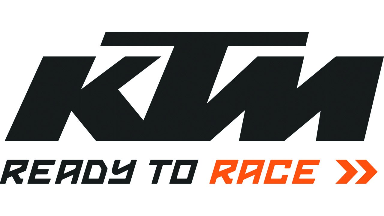
2003 – Today
![]()
The current KTM logo is composed of a single wordmark with strict lines and sharp angles. It is usually executed in monochrome, but sometimes the black nameplate is placed on an orange background, to add more passion and power.
The Emblem
The KTM emblem, placed on the brand’s motorcycles, is a three-dimensional wordmark, executed in dark gray metal. It looks masculine and strong, showing the company’s values of speed and quality.
The simplicity of the KTM emblem only adds a sense of luxury and expertise to the brand, reflecting it as powerful and progressive.


