

![]() Abarth Logo PNG
Abarth Logo PNG
Abarth is an Italian car manufacturing company, which was organized in 1949 by a former biker, Carlo Abarth. Abarth is mainly known for its collaboration with Fiat and a famous Fiat 500 Abarth model.
Meaning and history
![]()
After a serious accident, Carlo Abarth left his biking dream and became an automobile designer. Carlo created the brand’s famous logo in 1949. He chose a scorpion as an emblem due to two reasons: his zodiac was Scorpio; and the uniqueness of the creature.
What is Abarth?
Abarth is the name of a luxury Italian car brand, which was established at the end of the 1940s and named after its founder, a famous biker, Carlo Abarth. The brand is known for remaking existing cars and enhancing their technical characteristics and appearance. Abarth mostly tunes Fiat 500 sedans, making them faster and more powerful.
1949 – 1954
![]()
The very first Abarth logo from 1949 was composed of a blue scorpion image with black outline and red wordmark in all caps “Abarth & Co — Torino”. It was a bright logo with clear confident lines and stayed with the brand for five years.
1954 – 1958
![]()
In 1954 the Abarth logo was redesigned and started taking the form we all know now. The shield-like shape of the emblem was colored yellow and red with the blue outline and arched lettering. The scorpion figure in the center of the emblem executed in blue. Through the years the logo was slightly modified, the outline became thinner and the colors — brighter.
1955 – 1958
![]()
An alternative version had a lot in common with the logo introduced in 1954. The color palette was not as bright, and sky blue replaced dark blue. The scorpion, which was redrawn a bit, was also done in a sky blue and black color palette. Another major change consisted of an introduction of a Gothic style of font. The inscription was still yellow with a thin black outline.
1958 – 1969
![]()
The scorpion image becomes more geometric and changes in color to black. The Abarth wordmark also changes palette to white on a light blue background.
1969 – 2007
![]()
The brand decided to bring the blue scorpion back and add the colors of the Italian Flag to the wordmark. One more experiment of 1971 was a purple scorpion figure on a yellow and orange background.
2007 – Today
![]()
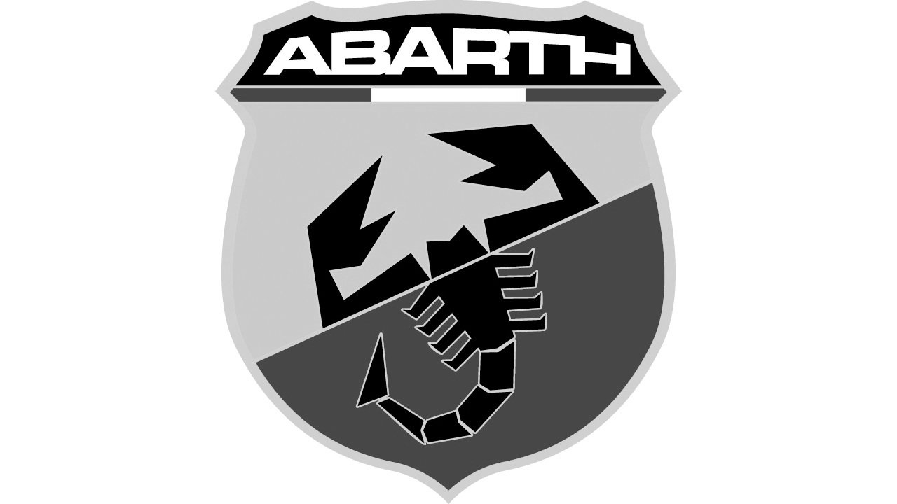
The new Abarth logo was designed in 2007 and only slightly refined during the years. Today the logo is composed of a curved shield with gray outline the background is diagonally split into two parts — red and yellow, the wordmark is placed on the top of the shield on a black background with the Italian tricolor lining. The scorpion is abstract and black, which makes the logo look sharp and masculine.
The white lettering in all caps features a custom typeface with hold sleek lines.
The Emblem
The iconic Abarth emblem always featured an image of the scorpion. It is a unique and strong symbol, which adds power and brutal character to the brand’s visual identity.
In the early years, the scorpion featured a blue color and was very detailed. But today the icon is executed in abstract geometric style, which makes the logo look modern and fancy.
The Abarth Emblem is a masterpiece of the contemporary visual identity design.
Font and Color
The stylized uppercase lettering from the sleek Abarth logo is set in a custom sans-serif typeface with straight lines and edgy cuts of the bars. The inscription is based on a commercial extended font, but as it is inscribed into the Abarth crest, it has letters featuring different sizes. The closest fonts to the one, used in this insignia, are, probably, Microgramma Pro Bold Extended and Unison Pro Bold, but with some minor modifications.
As for the color palette of the Abarth visual identity, it is intense and bright, composed of several shades, and evoking a sense of power and determination. The palette consists of yellow, red, and black (primary colors), with an addition of white and green, and silver metallic for the framing and small accents.


