The Kontinental Hockey League (KHL) is a prominent professional ice hockey league in Eurasia. Established in 2008, it functions as an international platform for the sport, primarily based in Russia. Owned by a collection of its member clubs, the league is overseen by a governing body. The KHL extends its influence across several countries, including Russia, Belarus, China, Finland, Latvia, and Kazakhstan, making it a truly transcontinental endeavor. This wide-reaching operation allows for a diverse array of teams and players to participate, fostering an international hockey community.
Meaning and history
The Kontinental Hockey League was founded in 2008 as a successor to the Russian Superleague. This inception marked a significant expansion in the realm of professional ice hockey in Eurasia. The KHL quickly established itself as the premier league in Europe and Asia, attracting top talent from around the globe. Its formation symbolized a new era in international hockey, offering a competitive alternative to North America’s NHL. Over the years, the league has celebrated numerous milestones, including expanded team rosters, high-profile player signings, and increased global viewership. Today, the KHL stands as a major player on the world stage of professional hockey, known for its high level of play, international reach, and significant contribution to the sport’s global popularity.
What is Kontinental Hockey League?
It’s an elite professional ice hockey league, operating primarily in Russia with teams across Eurasia. Founded in 2008, it’s known for its high-caliber play and international influence, rivaling North America’s NHL in prestige and talent.
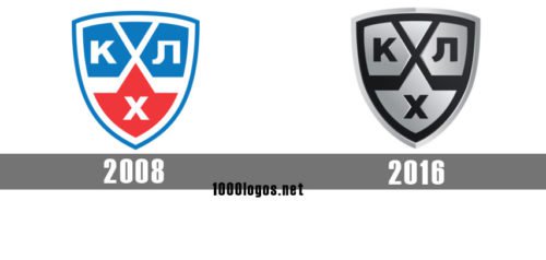
2008 — 2016
 The original Kontinental Hockey League logo, similar to the current one, featured a shield with three angles and rounded sides. The filling was white, while the outline was light blue. Apart from the white background, there were four fields inside the shield. The two larger blue fields on the top featured the analogs of the letters “K” and “L” in the Russian alphabet. Between them, a smaller triangular field in blue could be seen. Below, a large red field housing the analog of the letter “H” in the Russian alphabet was placed.
2016 — Today
In advance of the 2013/14 playing season, the KHL logo was slightly refreshed. The structure remained unchanged, but gradient textures were applied to the blue and red fields.
An updated shield was introduced by the beginning of the 2016/17 playing season. Here, the palette was replaced by a combination of black and silver. The silver fields had a gradient texture because of which they adopted a 3D feel.


