The KBO League, a prominent professional baseball league in South Korea, is overseen by the Korea Baseball Organization. Unlike typical companies with a singular owner, the league comprises an assembly of franchises owned by various major corporations in South Korea. These franchises operate within a well-structured league system, providing a stage for baseball talent across the nation. The KBO League operates primarily in South Korea, with its teams located in cities across the country, from Seoul to Busan, offering a national footprint that deeply influences South Korean sports culture.
Meaning and history
The KBO (Korean Baseball Organization) was formed with the Korean Professional Baseball League in 1982. Each team plays 133 games per year. The Korean league also has an all-star game similar to American Major League Baseball (MLB). KBO runs all of these games. The South Korean professional baseball league has clearly established itself as a unique phenomenon in the world of sports with its own support culture and trendy bat flip.
What is KBO League?
It’s a professional baseball league based in South Korea, governed by the Korea Baseball Organization. Comprising several teams owned by major South Korean corporations, it showcases the country’s top baseball talent and plays a pivotal role in the development and popularity of baseball in South Korea.
1982 – 2012
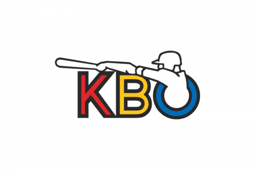
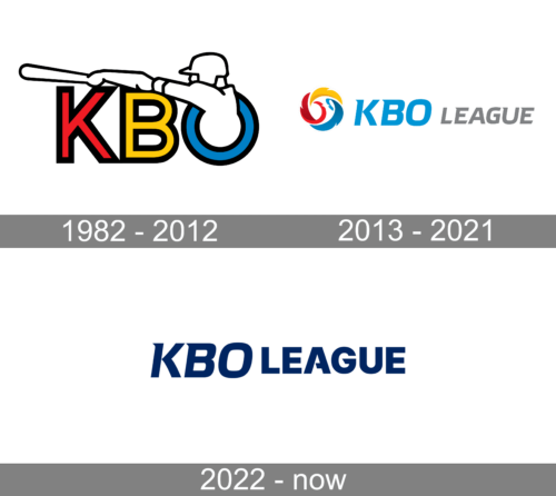
The 1982 logo depicts the acronym of the organization, written in red, yellow and blue respectively. Each of them is also given a thick black outline. There’s also a silhouette of a baseball player wielding a bat sticking out from inside of the last letter.
2013 – 2021
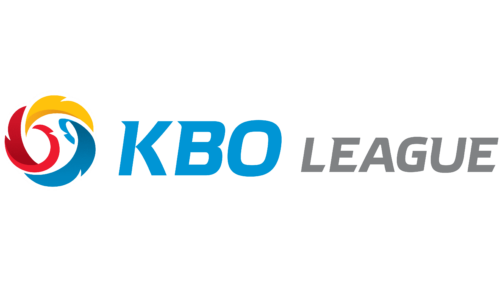
The pictorial part of the KBO League logo consists of a roundel emblem based on a highly stylized baseball given in red and white. The baseball appears to be flying at a very high speed leaving a trace of three colors: red, yellow, and blue. The trace has an uneven border making it look like feathers.
Next to the emblem, there’s the lettering “KBO” (sky blue) and “League” in grey. The old Korea Baseball Organization logo (adopted in 1982) featured the abbreviation “KBO” with a player “crawling” out of the final letter.
2021 – Today
The new logo is a modified version of the previous one. The designers removed a fiery ball and left only the inscription. They made it a dark blue color to create a more professional and serious look. The font for the “League” part was changed. The letters were no longer italicized and were made larger, almost as tall as the “KBO” portion of the name. The logo turned out clean and modern.


