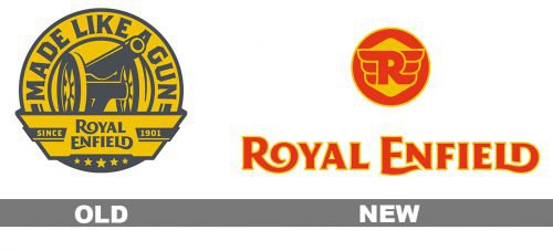
The most recent step in the evolution of the Royal Enfield logo took place in 2013-2014 when the brand identity went through a complete overhaul including the wordmark, the crest, and the seal.
Meaning and history
The India-based motorcycle manufacturing brand Royal Enfield has British roots. Back in 1851, George Townsend founded a business making sewing needles in Redditch, Worcestershire, England. The business went a long way before it started manufacturing motorcycles and motorcars (in 1901 and 1902 respectively). By the time, it was led by Albert Eadie.
The motor production became an independent subsidiary and was incorporated in 1906. The company only survived about a year and a half. As it reported a substantial loss, the business was sold to Birmingham Small Arms Company. Albert Eadie and BSA produced a variety of military riffles, cycle components, and motorcars. Later, the business was purchased by Birmingham’s Alldays & Onions Pneumatic Engineering.
In 1955, Enfield Cycle Company created a division in India in collaboration with Madras Motors. Here, the 350cc Royal Enfield Bullet motorcycle was manufactured.
While the main business ceased to exist in 1978, the Indian factory is still quite commercially successful.
The crest symbol
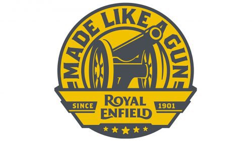
Similar to the old crest, the updated version features a canon. As the company explains it, the early history of Royal Enfield was connected with weapon manufacturing. While the previous logo gave a side view of the canon, in the current one, it has been slightly rotated to us, although it’s still not facing us directly.
In addition to the canon, the brand’s weapon origins are reflected in the lettering “Made like a gun,” which can be seen on both the old and new crests. The updated version also includes the wordmark and the lettering “Since 1901.”
On the whole, the new crest looks a bit cartoonish in comparison with its predecessor. It works much better at smaller sizes. On the downside, it lacks the genuinely vintage style of the previous version. While a simple and minimalistic design is basically not a bad thing, the approach doesn’t seem beneficial here.
Emblem on the seal
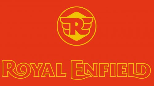
Both the old and new seals are based on a circle shape. While the old version featured silvery “R” and “E” over the black background, the new one is more complex. Its centerpiece is a bubbly winged “R” encircled by the lettering “Royal Enfield since 1901.” Actually, these are not just wings – they represent a double “E.” The hidden letters aren’t that obvious, though, unless you read the company’s press release.
For years, a pair of wings has been among most often used symbols meaning “speed.” Many car or motorcycle logos feature wings. Here, the wing theme lacks a unique touch that could have made the Royal Enfield logo stand out among other “winged” emblems.
Wordmark
Similar to the old version, the 2014 insignia features the name of the brand given in two lines in yellow and blue. However, the style is different. The updated logo is more rounded and elaborate, with somewhat thicker letters. The difference in height between the initials and the lowercase letters is smaller in the second logo.
While the serifs have grown less prominent, the type is still very distinctive due to the pairs of letters merging together: the “R” and “O,” the “E” and “N,” the “L” and “D.”
Font
The type used on both the crest and the seal appears to be Emigre’s Brothers Bold. While it’s a rather unique and impactful type, many designers have used it to create a vintage or rough effect making it a somewhat generic choice.
In comparison to it, the old type looked a bit more genuine and conveyed a hand-crafted approach.
Colors
The three-color palette includes a greyish shade of yellow, red, and grey. The colors “rhyme” with the motorcycles on which the Royal Enfield logo is placed: the grey fits the silvery details, the yellow fits the gold details, while the red “rhymes,” for instance with the color used for the arrow on some of the devices.


