K-R-I-T Motor Car is an early 20th-century American automobile manufacturer. Owned by John B. Kelly, the company specialized in the production of well-crafted vehicles. The enterprise had its operations based in Detroit, Michigan. Known for quality workmanship, K-R-I-T cars were highly regarded during their time.
Meaning and history
Founded by John B. Kelly, the K-R-I-T Motor Car Company started its journey in the early 1900s in Detroit, Michigan. Over the course of its existence, the firm was celebrated for producing automobiles of exceptional quality and durability, establishing itself as a noteworthy competitor in the American automotive market. One of their significant achievements was the acclaim they received for their superior craftsmanship and innovative designs. Today, while the company is no longer operational, its legacy endures as a testament to the early innovation and standards of the automotive industry.
What is K-R-I-T Motor Car?
K-R-I-T Motor Car was an American car manufacturer from the early 1900s based in Detroit, known for producing high-quality vehicles under the ownership of John B. Kelly.
1909 – 1913
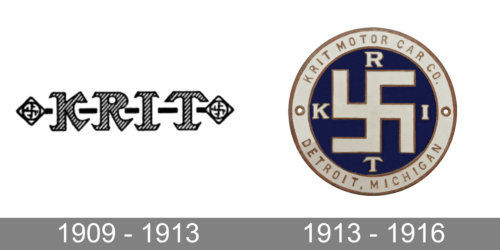
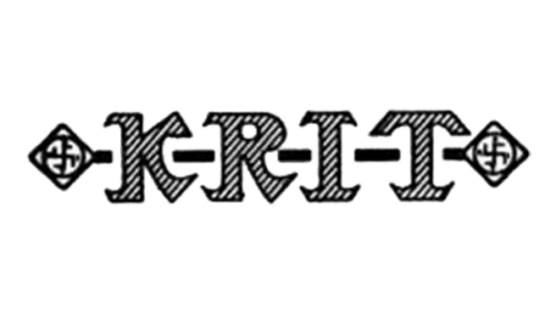
This logo looks very impressive thanks to the interesting pattern and font choice with pointed serifs. Each character was separated by dashes and had a diagonal black-and-white line pattern. On either side of the inscription, the logo featured squares placed on an angle and had a round shape with a swastika symbol inside. This emblem looks nothing like other automobile logos.
1913 – 1916
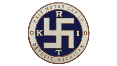
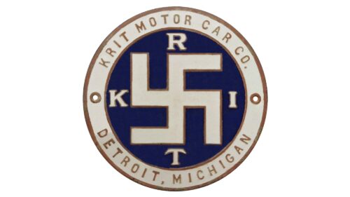
The logo consists of a dark blue round emblem with a light beige frame that has thin brown lines on either side. The border carries the full name at the top and the location at the bottom. In the center, the logo features a swastika symbol that is done in a light beige color with a thin brown outline to match the border. On each side of this symbol, there is a beige letter. These characters spell out the name of the company using a serif font similar to the one used in the earlier logo version. The logo turned out well put together, while the muted color palette created a feeling of stability and confidence.


