In spite of its sharp teeth, the Hammerheads shark from the Jupiter Hammerheads logo doesn’t look scary. Instead, there’s a cartoonish feel about it.
Meaning and history
The Jupiter Hammerheads team was established in 1998 in the town of Jupiter in Palm Beach County, Florida, where it has been based ever since. Today, it’s a Single-A affiliate of the Miami Marlins club. However, the Hammerheads only upgraded their level from the Class A-Advanced in 2021.
The members of the Florida State League, Jupiter Hammerheads don’t boast a lot of loud wins: the only League title was won by the club in 2023, and the Division titles were taken twice — in 2012 and 2023. However, the Hammerheads look quite promising, as their latest appearances on the field are much stronger and confident.
In terms of visual identity, Jupiter Hammerheads chose not to invent a bicycle, and use the emblem, designed in 1998, at the very beginning of their history. However, there has already been one redesign of the club’s visual identity, with the rethought color palette creating a stronger and more eye-catching image.
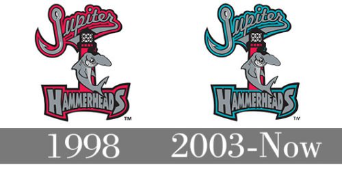
1998 — 2002
 The old logo depicts a hammerhead shark in front of a red lighthouse. The word “Jupiter” is placed above, while “Hammerheads” can be seen below.
2003 — Today
 The most notable update is the modification of the color palette. While the lettering on the old logo had the red outline, the team name on the 2003 logo has the teal outline. The color of the lighthouse remained unchanged, though.
Colors
The palette of the current logo is more complex in comparison with its predecessor due to the addition of teal.


