MINI is a brand of a British vehicle manufacturer, which was created in 1958 by Alec Issigonis from British Motor Corporation. Today the brand is a part of BMW Group and is one of the world’s most famous small cars designer and producers.
Meaning and history
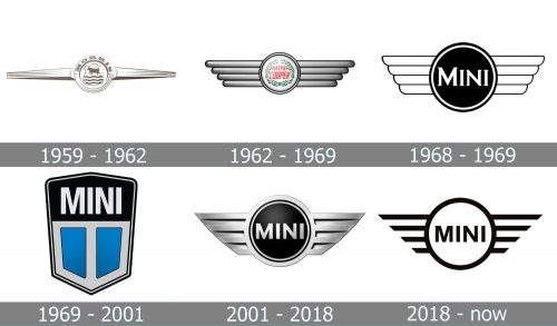
MINI was created in order to provide British people with small economical cars with low costs. The cars under the MINI trademark were produced by different manufacturers, so the brand’s visual identity was very different during its first years.
Only after MINI was acquired by BMW in 2000, the famous emblem became standard and got stuck to the brand.
1958 – 1962
The first two manufacturers of the MINI cars were located in Oxford and Birmingham. The Oxford MINI was called Morris Mini Minor, while the other one — Austin Seven. The models Gad different logos, and no common style.
Austin Seven logo featured a cursive handwritten wordmark with a coat of arms above it, while Morris Mini logo was a circle with two arrows coming out of it to the left and to the right. The Morris logo became the base for the MINI emblem we know today.
1962 – 1969
The company hired a new constructor, John Cooper, who created a famous Mini Cooper in 1961, which was followed by the new design of the logo and the new wordmark.
The 1962 logo featured a silver circle with red “Mini Cooper” lettering inside and two massive squared wings on both sides. That logo became an inspiration for the current one.
1968 – 1969
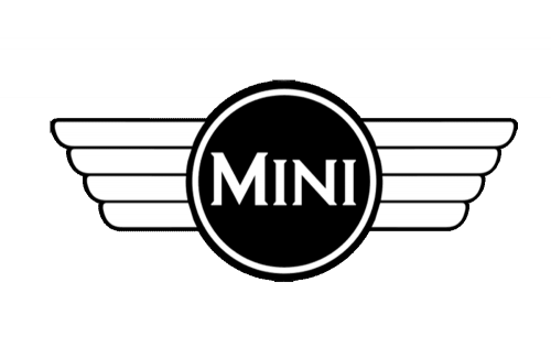
In 1968 the Mini logo started looking minimalist and modern, getting close to the image we all can see today. It was a solid black circle in a black and white outline, with the bold white “Mini” lettering set on it. The lettering was written in the uppercase with the first “M” enlarged. The inscription used a cool serif font with thick bars and thin sharp serifs. As for the iconic wings, they got shorter and now we’re only outlined in black, having the bodies of all “feathers” plain white.
1969 – 2001
The brand was acquired by Rover Group (Leyland Motors), changed its name to Mini and the new logo was designed in 1969. It stayed with the MINI for more than 30 years.
The 1969 logo features a hexagon, which is split inside into two parts: the upper one with a black background and a white bold wordmark, and the bottom one, composed of two turquoise parts, separated by the white thick vertical line.
The solid silver framing of the hexagon made the color contrast more intense and bright. The emblem’s symmetry added style and modernity, making the logo strong and remarkable.
2001 – 2018
After the acquisition of MINI by BMW, the iconic winged logo was brought back and modernized. The 2001 MINI logo became a three-dimensional figure, which featured a black circle with a silver outline placed between two silver wings with sharp angles.
The wordmark is executed in a sans-serif font with confident and neat lines. It looks simple and strict, making the logo stylish and powerful.
2018 – Today
After the redesign in 2018, the logo lines were refined and the color palette switched to monochrome. The brand came back to a laconic two-dimensional emblem, accenting on straight and bold lines of the wings.
It is a very strong visual identity for a car brand, which fully reflects the spirit of the company.
The Emblem
The Iconic MINI emblem was created in 2001. It is composed of a circle with two wings, which symbolize freedom and speed, the two most important qualities of the modern world.
The wordmark is placed inside the circle and balances the geometry of the emblem, which wings are sharp and straight.
It is a stylish and laconic emblem, that celebrates the free spirit of the brand, its youth and focus on design. It looks good on the car, featuring a silver color, and on the printables and web editions, in its monochrome palette. The emblem is bold and strong, instantly recognizable and reflecting the brand’s philosophy.


