

![]() Jake Paul Logo PNG
Jake Paul Logo PNG
While the actor and YouTube vlogger Jake Paul has had several logotypes, we’ll focus on the two main ones: the logo of his YouTube channel and the emblem used for the merchandise.
Meaning and history
![]()
The full name of the American actor and Internet personality is Jake Joseph Paul. He started his way to fame in 2013 by posting videos on the now-defunct application Vine. He starred as Dirk in Disney Channel’s series Bizaardvark but left the series in the middle of filming the second season.
Symbol used for the merchandise
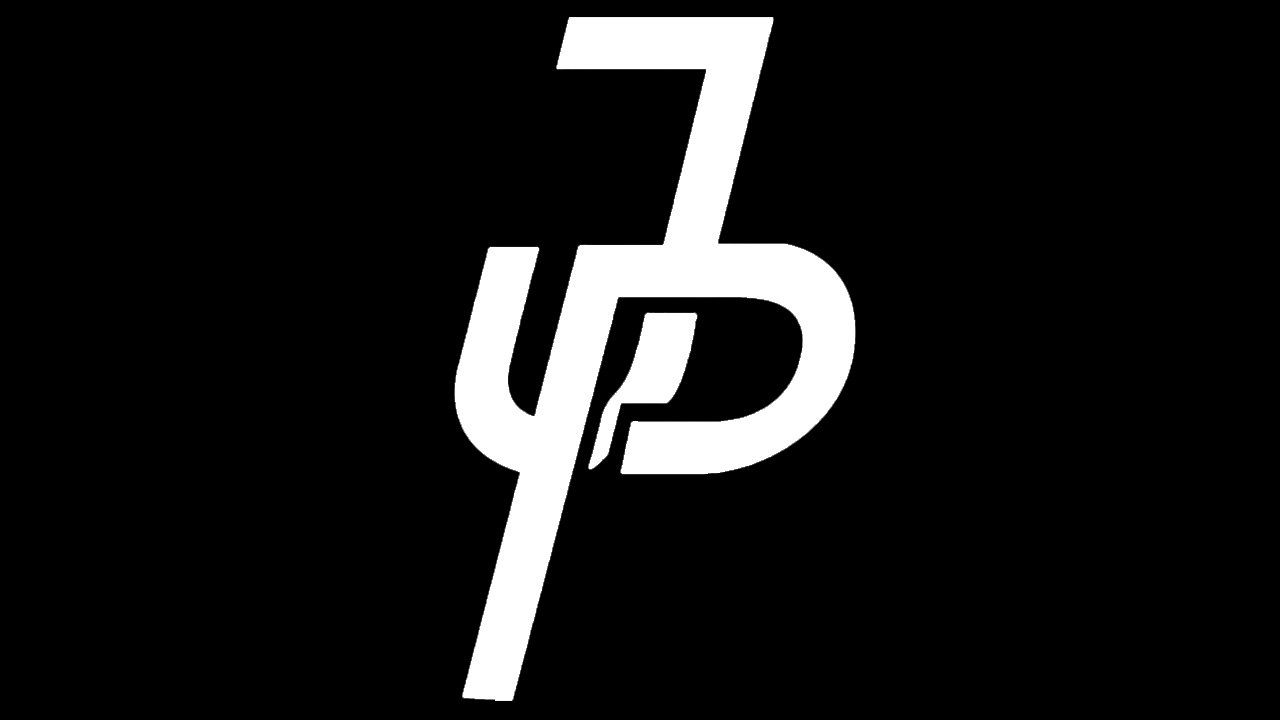
The Jake Paul logo features a stylized letter “P” placed over a “J.” The letters, in their turn, are placed over a five-pointed shape resembling a diamond.
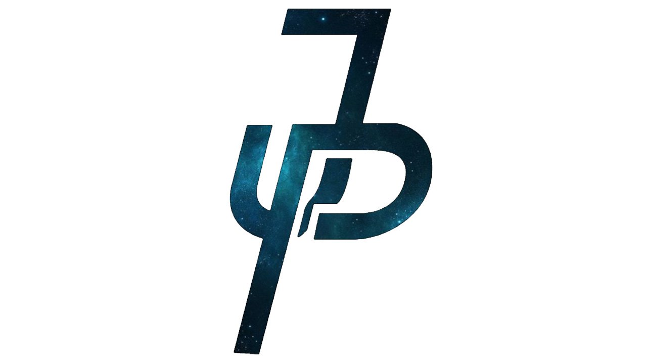
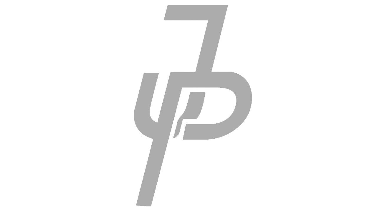
You can come across several versions of this logo. In some cases, only the color is altered, while in other cases, the differences are more profound. For instance, you can see versions without the diamond on the background. This emblem can be encircled by the lettering “It’s everyday bro” in a simple sans serif all-cap type. Sometimes the letters are given with a white and light grey outlines. Jake Paul also uses an emblem where his initials have been written by hand.
No matter how different the modifications can be, all of them are focused on one and the same core: overlapping “J” and “P.”
However, one can also come across an emblem with a completely different structure containing the full name of the vlogger given in an extremely heavy type. All the letters are capitals. They stick together in some places.
YouTube channel emblem
This version features a stylized depiction of Jake’s face over pink background. Here, Jake has extremely large eyes. This seems a pretty natural approach, as Jake himself has very prominent and distinctive eyes, which are an important part of his personal brand. His famous curly blond hair and the recognizable mouth are there, too.
Font
What are the most characteristic features of the custom letters? You can notice a gap in the middle of the “P,” as well as the fact that the letters seem to echo each other’s curves and proportions.
Colors
![]()
As the Jake Paul logo is often featured on clothes and other items of various colors, it’s only natural that its basic version is the black-and-white one. It can be easily modified to fit the background. Also, you’ve probably seen a colored version where the diamond shape on the background is yellow. Here, the letters are black and have a yellow outline separating them from the black background.


