

![]() Gremlins Logo PNG
Gremlins Logo PNG
The Christmas movie “Gremlins” tells the story of a mysterious furry creature named Magwai. He is able to evoke feelings even in a cobblestone. Gremlin has excellent hearing but can die from sunlight. It must not be allowed near water or to eat after midnight. The action takes place in a small fictional town on Christmas Eve, in which sinister creatures appear. They are causing havoc across the town. The movie turned out to be an amazing mix of classic 80s horror film and fun comedy for the whole family. The budget of the film cost the creators $11 million, but the collections for this fantasy horror film exceeded the $153 million figure.
Meaning and History
![]()
The name of the main character, Magwai, is translated from Cantonese Chinese as Gremlin, which is where the movie got its name. It was released in the United States on June 8, 1984. In 1985, Gremlins received the Saturn Film Award in five nominations. The film was so successful that a sequel, Gremlins 2: The New Batch, was made in 1990. This was the rare case when the creators manage to strike the right balance between well-made horror stories and really funny humor.
What is Gremlins?
Gremlins is one of the famous horror comedies of the 80s. It serves as a great example of the collaboration between Joe Dante (director) and Steven Spielberg (screenwriter). This is one of the few movies where you can see Spielberg himself on the screen.
Gremlins (1984)
Main Logo
![]()
The movie logo was nothing extraordinary as it featured only the name. It was printed using a red, sans-serif font. The red color, all uppercase letters, and funky lettering hints that these cute creatures can be dangerous and reflects the chaos that was caused by Gremlins. To give the logo a stronger look and ensure that the letters do not get lost on colorful backgrounds, the designers added a dark shadow, which created a 3D appearance.
Secondary Logo
![]()
The secondary version featured the name of the movie printed using the same font only in light gray color. It was placed on a black background and was accompanied by an icon on the right. It was depicting a white gift box with Gremlin peeking from inside and a grayish-blue circle in the background. The blue and black color was inversed in a re-release poster.
Gremlins 2: The New Batch (1990)
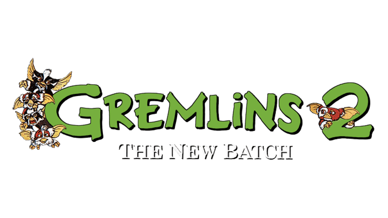
![]()
The logo for the second Gremlins movie used the same “Gremlins” inscription as the first. The designers added a tilted number 2 and a second line that said “The New Batch” in bold, bracketed serif font of black color. To embellish the logo, they also added an image of a Gremlin, which was peeking behind the letter “S”. The use of the same font helped the viewer remember the first successful movie and want to see the second as well.
Font and Color
The designers used the same font for all the logos. It was a bold, sans-serif font that looked a lot like Terry Junior Pro Deluxe by Monotype. In the second logo, they also added a line that featured a typical bracketed serif font. The original red color of the emblem hinted at the danger the little creatures brought. The second logo had a more calming grayish-blue color, which was accompanied by classic black and various shades of brown.


