Blue Sky Studios is a US-based computer animation film studio. It was established in 1987 by a team of former MAGI employees. The company is a subsidiary of 20th Century Animation.
Meaning and history
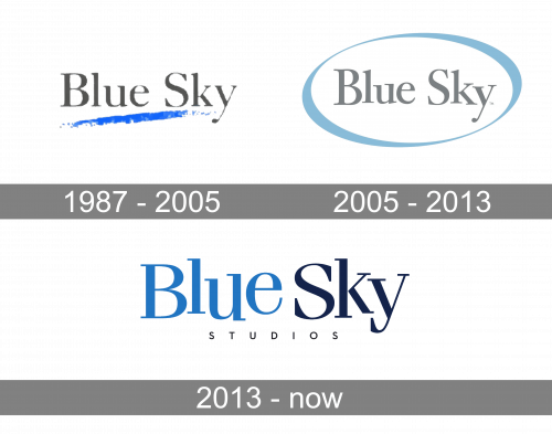
The company has introduced at least three distinctive logotypes over its history. All of them have shared the blue color in their palette, although the shades have varied. While there has also been something similar in the typeface, it has not looked the same.
1987 – 2005
The original Blue Sky Studios logo had the most prominent “sky” theme, in comparison with the following versions. It was introduced by an artistic blue stroke below the company’s name. The shape of the stroke reminded a thin, semi-transparent cloud. And also, it was a way to refer to the brand’s specialization and hint on all the artists who worked there.
In a lighter version of this logo, the letters are gray, while the background is white. In the version with the black background, the letters are white, while the shade of blue chosen for the stroke is very bright.
2005 – 2013
The careless “cloud” stroke was replaced by an elegant ellipse. The shade of blue has grown grayer, which made it look more muted and refined. The gray of the lettering became slightly lighter.
The serif type was modified, too. The most notable thing is the different height of the strokes forming the “u” and the “y.” They add some dynamism and playfulness. In a way, they echo the way the strokes forming the oval go from wider to thinner.
There were versions of this logo with additional curly strokes around the oval (you can come across them in “Horton Hears A Who,” for instance).
2013 – Today
The updated Blue Sky Studios logo cries “creative.” The fact that the letters are “jumping” has grown much more prominent. They look as if they have been written on the waves (or the clouds, of course) and are in never-ending motion.
The words have been moved close to each other but they are separated with the help of the color. For the first time, the word “studios” has appeared below the main wordmark. It is very small and features a much simpler type. This version made its debut in Epic.


