

![]() Breaking Bad Logo PNG
Breaking Bad Logo PNG
Breaking Bad is an American tv show, which is considered to be iconic. Released in 2008, the series has invaded millions of people from all over the globe, keeping them tense for five years. The last, fifth season of the series saw the light in 2013, but Breaking Bad is still an icon for many.
Meaning and history
The plot of the crime drama series “Breaking Bad” is about the life of Walter White, a fifty-year-old high school chemistry teacher who suffers from lung cancer. The series is set in Albuquerque, New Mexico. After learning a disappointing diagnosis, or rather a death sentence, Walter began to think about how to provide for his family, because cancer treatment is very expensive and does not give a hundred percent guarantee of recovery.
Unable to find a better solution, Walter begins producing illegal substances for sale. The Breaking Bad character is involved in his criminal case with a former student he himself helped expel from school, Jesse Pinkman, who in this case is smart.
The creators of the series “Breaking Bad” managed to accustom the audience to its unique manner of presentation, where events are not forced for the sake of extra spectacular moments. The show demanded the viewer’s attention and patience, for which it rewarded them each year with impressive denouements. From season to season, the show gained momentum, honed its quality, and gained an ever-increasing audience. Official television ratings reported a five-fold increase in viewership over the first year.
What is Breaking Bad?
Breaking Bad is an American television series that has won huge sympathy from viewers around the world. The first season of the series about a school teacher who started cooking methamphetamine was released in 2008. A total of 62 episodes of Breaking Bad were produced, with the final season released in 2013.
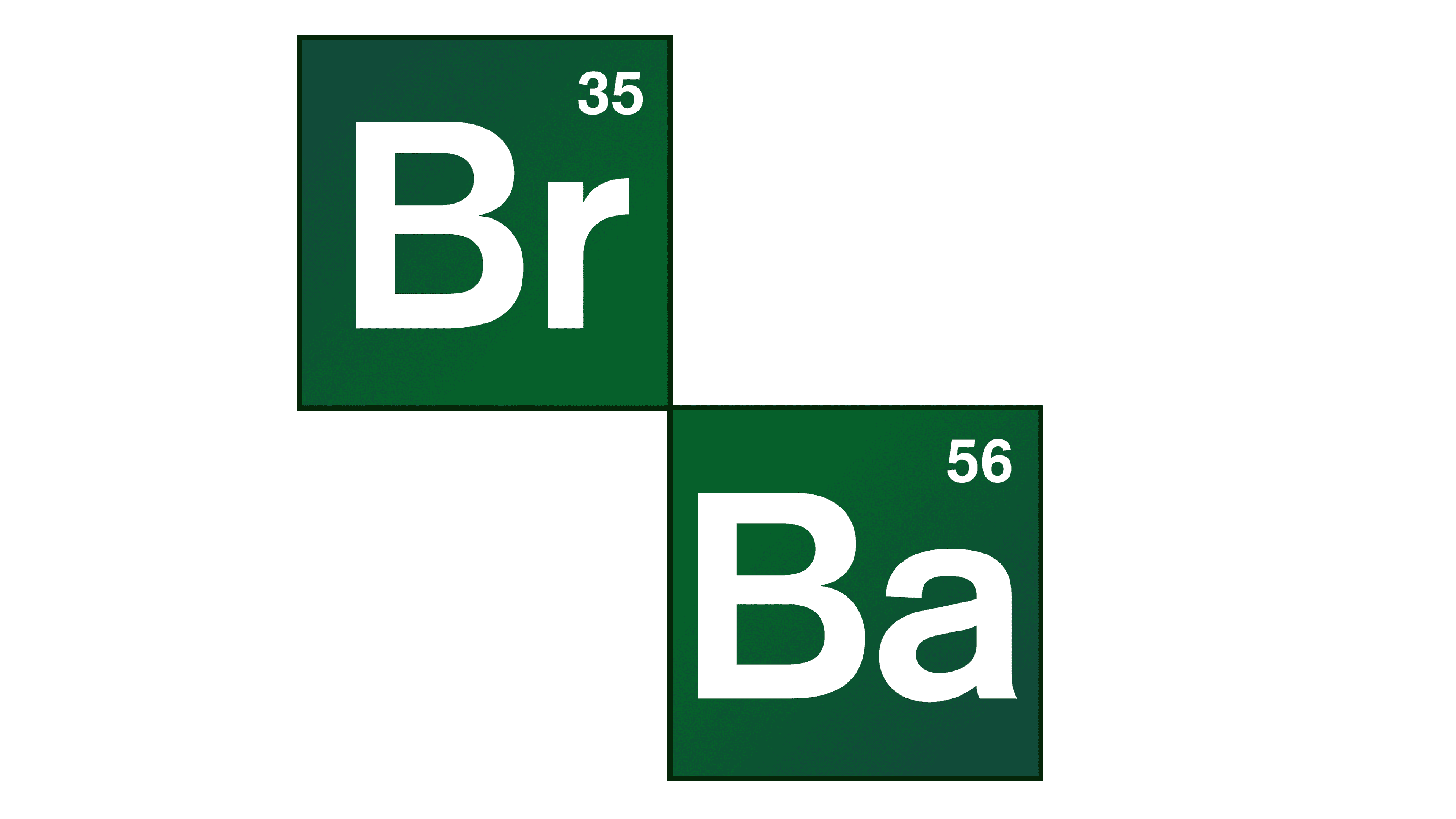
In terms of visual identity, Breaking Bad is the series, which chooses to be direct and literate in its logo design. The badge of the tv show is based on the lettering with two inserts from the Periodic Table of Mendeleev, which represent the “chemical” compound of the series’ plot, and its main idea.
2008 – Today
![]()
The Breaking Bad logo, designed in 2008, hasn’t been changed during the whole five-years period. This badge can pretty much be considered is conic in its simplicity and strictness. The logo is composed of a two-leveled inscription in dark blue, with the “Br” in “Breaking” and the “Ba” in “Bad” stylized as the cells from the Periodic Table of Mendeleev, standing for “Bromine” and “Barium” respectively. Those two elements are set in white in gradient green squares, set in the same typeface as the other characters of the wordmark, but with straighter cuts of the bars.
Font and color
The elegant and traditional lettering from the primary logo of Breaking Nad is set in a smooth serif typeface, with the “Br” and “Ba” parts more geometric and distinctive. The closest fonts to the one, used in this insignia, are, probably, Cooper BT Medium, or Cream Medium, but with some modifications of the contours.
As for the color palette of Breaking Bad’s signature style, it is based on green and white, where green is a symbol of life and movement, and white is a symbol of fidelity. It’s not very obvious what these cheerful and graceful colors have to do with the plot of the series, but Breaking Bad is a series not only about vices, but also about relationships between people.


