Iveco is one of the most well-known European companies in the industrial automobiles segment. It was formed in 1975 in Italy and today operates worldwide.
Meaning and history
The name of the brand, Iveco, is derived from the first letters of the original company’s name, Industrial Vehicles Corporation. The name became synonymous with high-quality buses and commercial cars.
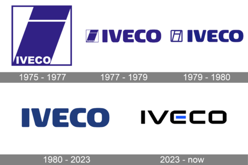
The Iveco visual identity has gone through three complete redesigns but kept the original color palette and the simplicity as a core principle.
1975 – 1977
The first Iveco logo was designed in 1975 and featured the elements of its forming companies’ visual identities.
There were five big groups, which merged in order to create the Iveco brand, three of them were Italian: Fiat, Lancia, OM, plus French Unic and German Magirus-Deutz.
The original I echo logo was composed of a square frame with two parts of the letter “I” placed diagonally and the wordmark executed in a traditional Gill typeface.
The bright blue and white color palette, as well as the geometric shape of the logo, was a tribute to Fiat and Unic emblems.
1977 – 1979
In 1977 the logo is split into two parts — the wordmark in massive blue lettering and an emblem on its left. The emblem is left untouched, just the white nameplate was removed from it.
1979 – 1980
The typeface of the wordmark is hanged to a more smooth and rounded front, which is close to Neo Sans. The logo now looks more confident and strong. The emblem was also changed, it became more airy, as the solid blue of the Iveco “I” was replaced by white with a blue contour.
1980 – 2023
In 1989 the brand decides to remove the emblem from its visual identity. The single wordmark is left and it is definitely enough, as the lettering looks powerful and evokes a sense of reliability and professionalism.
2023 – Today
The logo presents a modern and streamlined design with the word “IVECO” prominently displayed in bold, black lettering. The typography is sleek and contemporary, with clean lines and sharp edges, symbolizing precision and clarity. A noticeable design feature is the use of a bright blue rectangle, integrated seamlessly within the letter “E”, breaking the monotony and adding a touch of vibrancy to the overall aesthetic. This blue element may hint at innovation, trustworthiness, or a nod to technological advancements. Set against a pure white background, the logo achieves a minimalistic yet impactful look, emphasizing simplicity, reliability, and modernity.


