Isuzu is a Japanese brand of commercial-automobile manufacturer, which was founded in 1916 in Tokyo and today is one of the world’s most famous and trusted companies in the industry.
Meaning and history
The company was named after one of the Japanese rivers, Isuzu (which translates to English as “50 bells”), however, its original name was Ishikawajima until 1934.
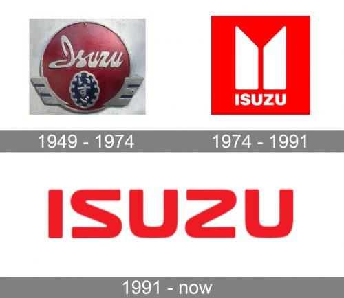
Isuzu’s visual identity has only three major versions during the whole brand’s history, and since 1974 the company never changed its iconic color palette.
1949 – 1974
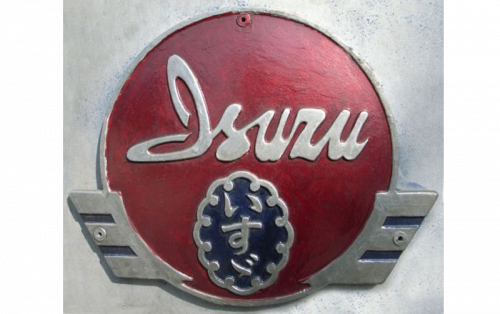
The original Isuzu logo was composed of a blue shield with oval ornate medallion, which contained a Japanese wordmark. The English version of the Isuzu brand name was placed on a red rectangular on the top part of the shield. The lettering was executed in a bold traditional typeface and featured white color.
1974 – 1991
In 1974 Isuzu started working with American GMC and designed a new visual identity. It is a bright red and white logo, which is composed of a wordmark and an emblem above it.
The emblem features two pillars with diagonally cut tops. There are several explanations of the 1974 Isuzu badge meaning: first of all, it is a stylized version of the Japanese symbol for the company’s name; the other idea is a reflection of excellence, as pillar were commonly used by many craftsmen; the third interpretation of the Isuzu emblem is a celebration of company’s determination and constant growth.
The white wordmark and image are placed in a bright red background, which shows the company is dynamic, energetic and passionate.
1991 – Today
In 1991 Isuzu simplifies its logo, making it more modern at the same time. Now the brand’s visual identity features only a wordmark, the emblem is removed.
The typeface of all the capital lettering is smooth and bold, “S” is a reflection of “Z”, which adds symmetry and unique style to the logo.
The color palette remains unchanged — it is still white and red, just sometimes brand switches the colors of the lettering and the background, depending on the placement.
The Isuzu logo is strong and powerful in its simplicity. It is a perfect reflection of the brand’s values of progress and its influence. The minimalist approach says a lot about the company’s philosophy, which main aim is to provide the highest quality and make their customers come back.


