Isotta Fraschini is an Italian luxury car manufacturer. Established in 1900 by Cesare Isotta and the Fraschini brothers, the company originally focused on producing automobiles but later shifted to aero and marine engines. Currently headquartered in Milan, it boasts a rich history marked by luxurious vehicles and innovative engineering.
Meaning and history
Founded in 1900 by Cesare Isotta and the Fraschini brothers, Isotta Fraschini soon became synonymous with luxury and quality in the automobile world. In its prime, the company introduced the Tipo 8, the first production car with a straight-eight engine. Their vehicles became favorites among the elite. However, post-World War II pressures forced the brand to pivot towards aero and marine engines. Today, Isotta Fraschini, still rooted in Milan, remains a symbol of Italian luxury and innovation, albeit in different sectors.
What is Isotta Fraschini?
Isotta Fraschini is an Italian company established in 1900, known initially for its luxury automobiles. In later years, it transitioned to producing aero and marine engines. Based in Milan, the brand stands as an emblem of Italian elegance and engineering.
1900 – 1908
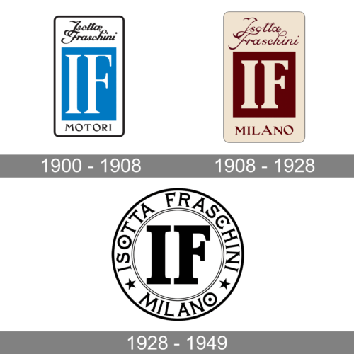
The first logo of the brand is a perfect combination of strong, solid elements with more delicate inscriptions that add a touch of sophistication and beauty. The logo of the company had the shape of a vertical rectangle with a white background and a thin black frame with rounded corners. A smaller blue rectangle was placed in the center to serve as a base for the short version of the company name. It featured a bold font with bracketed serifs. The full name, on the other hand, was printed using a fine cursive font with elegant curves. At the bottom, there was the word “Motori” printed using a black color and all uppercase letters with bracketed serifs.
1908 – 1928
The color palette update was the most noticeable change here. The white was replaced by a light beige color, while black and blue elements were now done in brown, making the logo look more monochromatic. When you look closer, you will see that the emblem became wider and the rectangle in the center turned into a square. The full name across the top featured the same font only finer lines, which added elegance to the logo. As a last final touch, the company replaced the word “Motori” at the bottom, with the location of the headquarters – Milano. The use of the same font once again preserves a recognizable brand image.
1928 – 1949
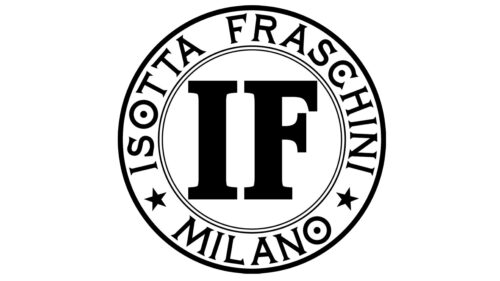
This logo looks completely different than earlier versions thanks to its round shape and black and white color palette. However, there is one element that made the association with the brand very easy. It was the two initials printed in the centers using the same font as previously. The full name and headquarters location were now printed using a more basic serif font and all uppercase characters. Both inscriptions curved around the border of the emblem and were separated by two stars. This new spin on the brand’s logo reflected the company’s continued growth and improvement.


