The ice hockey team Iowa Wild belongs to the American Hockey League and is the affiliate of the NHL’s Minnesota Wild.
Meaning and history
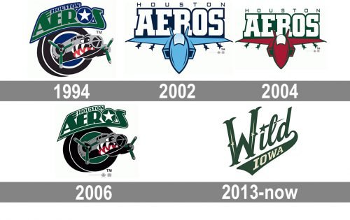
The club was established under the name of the Houston Aeros in 1994 as part of the IHL but joined the AHL in 2013.
1994 — 2002
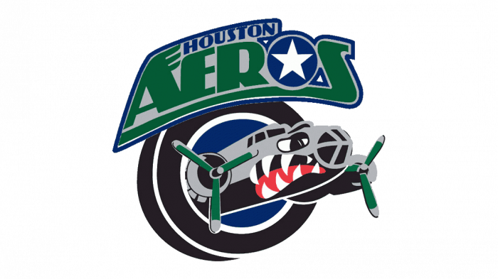
Until 2013 the name of the Iowa Wild hockey club was Houston Aeros. And the wordmark with this name could be seen on each of the logo versions, created for the team in 1994. The very first badge featured a dark and intense image of an airplane flying out of the black and blue ring, with a bold stylized inscription above it. The inscription was executed in dark green and blue, on a solid gray background. The letter “O” was replaced by a plain blue circle with a white five-pointed star in its center.
2002 — 2004
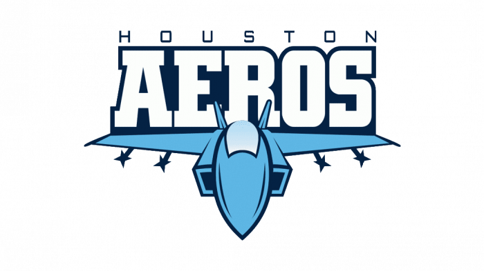
The redesign of 2002 introduced a simplified and light version of the Houston Aeros visual identity. It was a sky-blue plane with white and navy lettering above it. The plane has some dark blue details (like four four-pointed stars), which balanced the color palette of the wordmark. The “Aero” in elegant and bold uppercase letters was written in white and featured a bold outline, while the “Houston” in lightweight sans-serif font was written above it with lots of space between its thin lines.
2004 — 2006
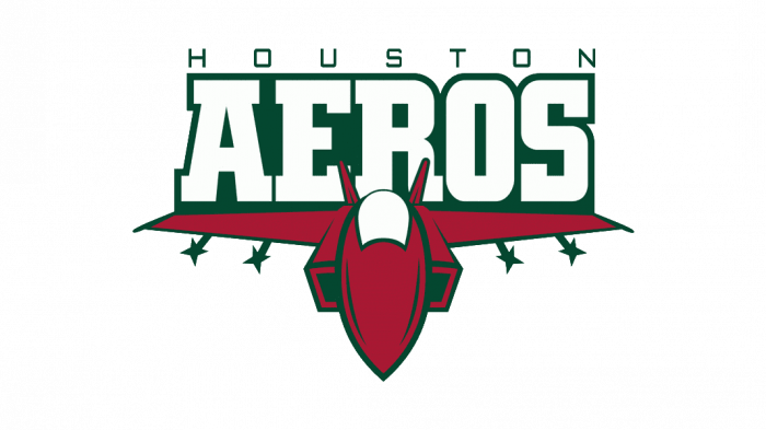
The redesign of 2004 switched the color palette of the Aeros’ logo, keeping all shapes and elements untouched. The primary colors were now dark emerald and burgundy, which were complemented by white elements, making it lighter. The plane was executed in burgundy, with green contouring and details, and a white window on top. As for the wordmark, the “Aeros” is massive capitals were white, with each letter outlined in thick green, and “Houston” in same thin lines, balancing the heaviness of the badge.
2006 — 2013
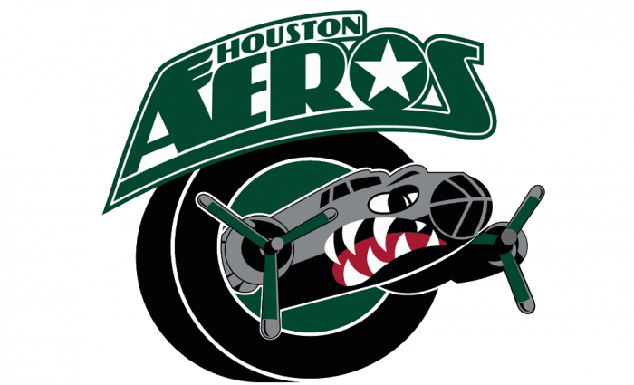
The original logo for the hockey club returned in 2005 in a new color palette. The caricature of an airplane resembling a shark with sharp white teeth was now executed in green, gray, and black color palette, with some dark red accents. The lettering was all green and white (including the stylized letter “O” with a five-pointed star), a black ring, looking more like a tire, and the plane itself — gray and black, with a red “tongue” behind white teeth, and two green propellers.
2013 — Today
The club was established under the name of the Houston Aeros in 1994 as part of the IHL but joined the AHL in 2013. It was then that the current logo was adopted. It features the word “Wild” in a beautiful script, where the end of the “D” is extended to form a ribbon, upon which the lettering “Iowa” is placed.
Colors
The lettering “Wild” is colored in Forest Green with details in the shade of beige called Minnesota Wheat. By contrast, “Iowa” is written in beige over the green background. White is used for the background. While the official palette also includes Iron Range Red and Harvest Gold, they don’t actually appear on the Iowa Wild logo.


