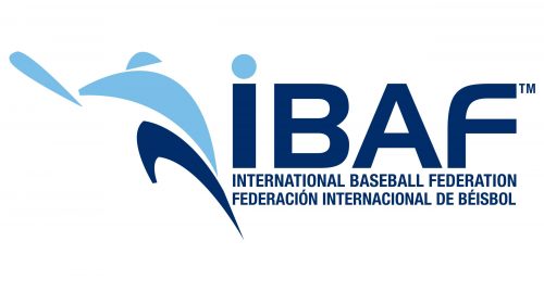
 International Baseball Federation Logo PNG
The International Baseball Federation (IBAF), not a company but a sports organization, plays a pivotal role in governing international competitions in baseball. Unlike a typical company, the IBAF doesn’t have an owner but is overseen by a council of members from various national baseball federations. Central to its operations, the IBAF is responsible for setting rules, standards, and organizing international tournaments like the World Baseball Classic. Its sphere of influence extends globally, coordinating with member organizations across continents to promote and develop the sport of baseball worldwide.
Meaning and history
Founded in 1938, the International Baseball Federation emerged as the global authority for baseball, initially known as the Fédération Internationale de Baseball Amateur (FIBA). Its inception marked a significant step in unifying baseball rules and tournaments across the globe. Throughout its history, the IBAF has achieved notable milestones, including the successful integration of baseball into major international competitions like the Olympics and the establishment of the World Baseball Classic, which has become a marquee event in the sport. Recently, it merged with the International Softball Federation to form the World Baseball Softball Confederation (WBSC) in 2013, reflecting its current position as a key figure in promoting and managing baseball and softball internationally.
What is International Baseball Federation?
The International Baseball Federation, known as the IBAF, is not a typical company but an international sports organization dedicated to overseeing and promoting baseball worldwide. It collaborates with national federations, sets game rules, and organizes major international tournaments, playing a crucial role in the global development of baseball.
Old

The centerpiece of their earlier logo was a baseball image with blue grids making it look like a globe. Over one of the ball’s seams, they wrote ‘IBAF’ in blue and red letters. Lastly, there was also a blue silhouette of a baseball player on the ball’s left half.
Today
While the International Baseball Federation logo features a pitcher, which is one of the most popular baseball logo elements, here it has a distinctive look. In combination with the color scheme consisting of two shades of blue, it makes the logo stand out.
If you take a look at the logos of the Major League and the Minor League Baseball, as well as most other emblems depicting a pitcher, you’ll notice that they all share a somewhat similar style. The player from the IBAF logo is different. It’s a combination of abstract geometric shapes which, when brought together, happen to resemble a pitcher.


