Instacart is a fast delivery service for groceries and household essentials to one’s home. Given the specifics of the products, the average delivery time does not exceed one hour. Users access the service via smartphone or computer, choose from a wide range of chain stores and create their own grocery basket. An hour later, a courier delivers the order to their doorstep.
Meaning and History
Apoorva Mehta, a former Amazon logistics specialist who was featured on the 2015 Forbes 30 Under 30 list, had the idea for Instacart when his refrigerator was almost completely empty. In a month, he created a preliminary version of the application. His first breakthrough came in 2012 when he joined the Y Combinator accelerator and raised $150,000. In early 2020, his Instacart grocery delivery app was just gaining momentum. The COVID-19 epidemic has given it a powerful impetus. The situation quickly turned into a nightmare with an employee strike, a shortage of goods, and difficulty meeting crazy demand. Nonetheless, in the first three months of this craziness, Instacart delivered more groceries than Walmart, the largest U.S. supermarket chain. The number of networks Meta works with has grown by 60%. Instacart remains a successful business.
What is Instacart?
Instacart is a grocery delivery service that operates in the US and Canada. It has contracts with over 500 retailers, including Costco, Wegmans, and Eataly. Instacart has no warehouses, stores, freezers, or trucks, just intellectual property underlying the application and the people that power it.
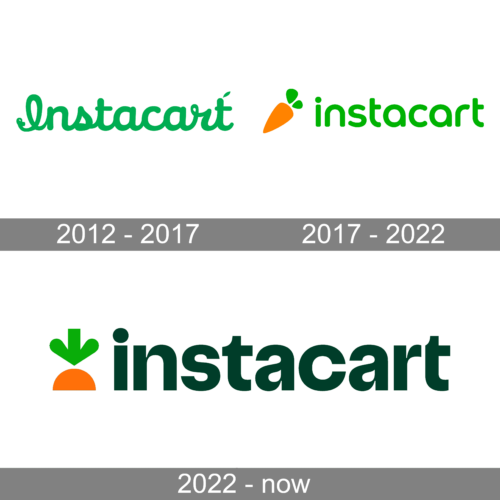
2012 – 2017
A beautiful, cursive inscription made an otherwise plain logo look elegant and unique. The first letter was capitalized and all the other letters had strokes connecting them. The logo featured a lively, happy green color that evoked positive emotions. The green is also closely associated with freshness and nature, signifying that the food delivery service will always deliver fresh products. This is supported by a tiny green leaf in the upper right corner of the wordmark.
2017 – 2022
It was not right away that the company came up with a brand image that it got associated with. Besides the green inscription, it got a bright orange and green carrot icon. It was placed on the left of the name at a diagonal and was slightly larger in height than the letters. The vegetable was most likely chosen for its color, which stands for happiness, friendliness, and enthusiasm, but also reflected the fact that the service could bring fresh food to one’s doorstep.
2022 – Today
A consulting firm TwentyFirstCenturyBrand from the United States in collaboration with the British advertising agency Wolff Olins created a new emblem for the company. The update was mainly done to maintain the attention of people on the service as they were feeling more comfortable going to the store themselves. Thus, the logo preserved both elements of the previous version making only modifications to them. The carrot was enlarged and planted, so only a portion of the root and leaves were visible. When it comes to the inscription, it looked the most different as the color was closer to black than green. Although the letters still had no serifs and were all lowercase, the font was changed.
Font and Color
An artistic, cursive font in the original logo was replaced in 2017 by a font that resembled Arista Pro Alternate SemiBold by Zetafonts. It featured fluent curves and thick strokes and had a very welcoming appearance. A new, unique font was introduced in 2022. It had bold strokes but also did not lack elegant, thin details. The font was very similar to Extatica Bold by Mint Type with a few modifications. A green and orange color palette is strongly associated with this shopping and delivery service. Although green has changed its shade several times, this color is unquestionably associated with freshness and nature and has always had a positive, friendly, and relaxing effect. The orange was chosen to bring a bright accent and add warmth and happiness.


