While the Illy logo has gone through several profound updates during its more than 85-year history, the red-and-white palette and casual touch have been creating a visual link between almost all the versions.
Meaning and history
Few people know that the iconic Italian brand of coffee Illy was founded by a native of Hungary. It was Francesco Illy, who decided to establish his new business in 1933, after moving to Italian Trieste.
At first, Illy’s business consisted of selling cocoa and roasting coffee beans. Over time, Francesco Illy focused only on coffee. And from selling, he moved on to innovations as well. One of his inventions was the Illetta automatic coffee machine, the predecessor of today’s espresso machines.
The Illy coffee is available in a fairly small range, but in a variety of formats so that you can get the classic illy flavor wherever you are, and however you make your drink. There is ground and grain coffee, coffee in capsules, and filter tablets.
What is Illy?
Illy is the name of an Italian coffee brand, which was established in Trieste at the beginning of the 1930s, and by today has grown into more than a label, but a symbol of the European coffee industry, wrapped up in Italian elegance and design.
1934
The familiar red-and-white color scheme could already be seen on the brand’s original logo. The design featured a thin red ring with white and red filling. The white field housed a crown, while the red field featured the lettering “Illy Caffee Permanente Freschezza.”
The word “Illy” was given in an elegant type. It was inspired by handwriting, although the letters were not connected with each other.
The trademark was developed by Xanti Schawinsky, a graphic designer and collaborator of the Boggeri studio. Around the same period, Schawinsky was developing the Olivetti logo. We should point out, though, that Illy’s first poster designed by Schawinsky featured a different wordmark, with more intricate letters.
1966
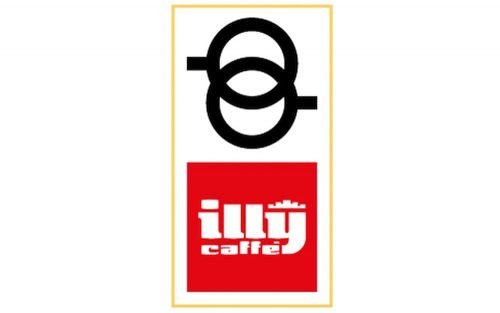
A new, simpler design was created by Carlo Magnani. The ring theme was separated from the wordmark. The logo now featured two rings with short horizontal bars, which represented two espresso cups (with handles) seen from above.
The wordmark in white was placed inside a red box. The white crown was positioned above the name of the chain.
This version had an apparent legibility problem, as the initial “I” could have been easily mistaken for a different letter.
1985
The legibility issue grew slightly milder because the lettering became larger. Although deciphering the initial “I” still presented a problem.
1992
The espresso cup design returned, while the wordmark grew simpler and better legible.
1996
James Rosenquist, a master of the pop art movement, painted a new poster, from which the current Illy logo was taken.
Font and Color
The bold custom lowercase inscription from the bright iconic Illy badge is set in a super heavy handwritten font with thick smooth lines of the characters. The closest fonts to the one, used in this insignia, are, probably, Flash Bold, and Tasty Bold, with some minor refinements.
As for the color palette of the Illy visual identity, it is set in a bright and powerful red and white combo, which looks very stylish and progressive, evoking the fundamental approach of the company to all the production processes, its professionalism, and expertise, along with a passion for a coffee.


