

![]() Truly Logo PNG
Truly Logo PNG
Truly is the brand of hard seltzer, one of the most popular beverage categories, produced by the American company Boston Beer. Truly is very popular, as it only has 100 calories, five grams of sugar and 5%, and an intense fruity flavor.
Meaning and history
Truly is one of the leading brands on the American market of hard seltzers. The brand was founded by the famous Boston Beer in 2016 and keeps invading top positions in terms of sales today. Boston Beer Company is a brewery that originated in 1984 and released the famous Samuel Adams Boston Lager. Today, the brewery is the fourth largest in the United States. The US seltzer market is dominated by Truly and White Claw, which together occupy about 75% of the market.
Truly Hard Seltzer is an carbonated water with natural fruit flavors placed in an attractive package. Truly Hard Seltzer and many other similar products do not have vodka or other spirits mixed in. The seltzer water comes from fermented cane sugar, which is produced using beer technology, and then subjected to added flavorings and carbonation.
Bursting onto the scene in 2016, in just three years, hard seltzers have become the fastest-growing beverage category in the United States.
There are several lines under the Truly brand – Lemonade, which is a mix of hard seltzer and sweet lemonade, and Iced Tea, a combination of seltzer and iced tea, as well as the Truly Punch Hard Seltzer flavor line.
What is Truly?
Truly Hard Seltzer is the beverage label, produced by Boston Beer, one of the largest craft beer producers in the United States and the creator of Samuel Adams beer. The company also produces Twisted Tea, Angry Orchard Hard Cider, and Tura, an drink based on tea mushrooms.
In terms of visual identity, the Truly brand has chosen a minimalistic approach, which is quite easy to understand, as the packaging of the product is always very bright and colorful. This is why the official logo has to be stable and perfectly readable.
2016 – Today
![]()
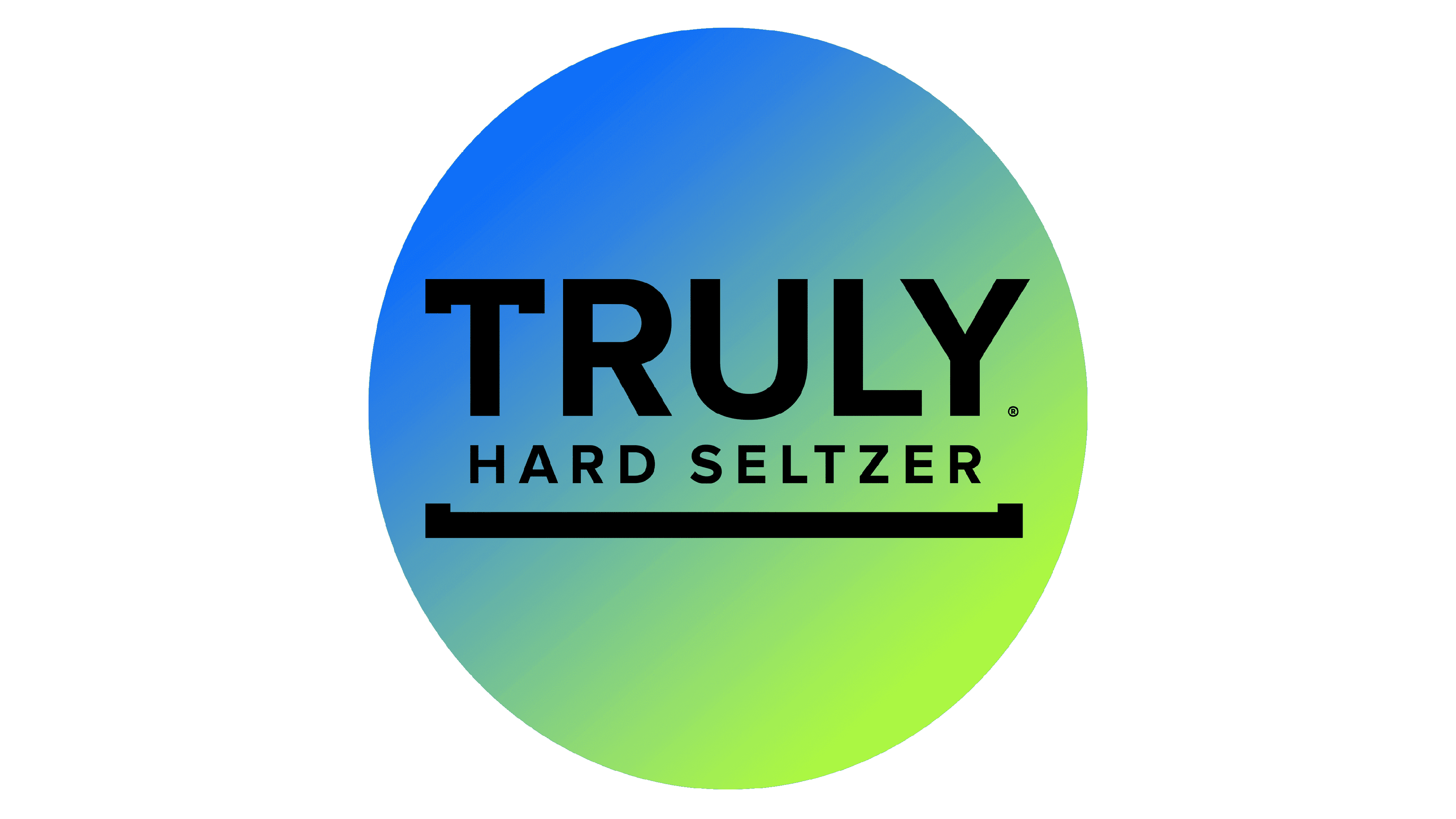
The Truly logo was designed in 2016 and has stayed unchanged for many years. It is a two-leveled lettering with a thick square bracket underlining it. The top line of the wordmark consists of an enlarged uppercase “Truly” in a bold geometric typeface with a customized letter “T”. Its horizontal bar repeats the shape of the square bracket from the logo’s underline.
The second level of the Truly badge boasts a laconic uppercase “Hard Seltzer” lettering in a simple modern sans-serif, with all the contours clean and distinctive. It balances the massiveness and stability of the upper line.
Font and color
The bold uppercase lettering from the Truly visual identity is set in a strong geometric sans-serif typeface with the first letter, “T”, having two square serifs on its horizontal bar. The closest fonts to the one, used in this insignia, are, probably, the fonts from the Gotham family, with the “T” customized.
As for the color palette of the Truly visual identity, it is based on the combination of black and white, which is always decorated with colorful patterns and images from the beverage cans and bottles.


