Illumination is a film and animation studio that belongs to Universal Pictures. It is headquartered in Santa Monica, California, U.S.
Meaning and history
Illumination, founded by Chris Meledandri in 2007, is one of the leading producers of animated films. Just nine years after its founding, Illumination Entertainment was able to break even, release six animated films and earn over $4 billion at the box office.
The portfolio of the studio includes such masterpieces as Despicable Me, the most successful animated franchise in cinematic history, as well as Dr. Seuss’ The Lorax, Dr. Seuss’ The Grinch, and The Secret Life of Pets and Sing. Illumination studios authored two of the top 10 animated films of all time.
Illumination’s iconic franchises, marked by memorable and distinctive characters, global appeal, and cultural significance, have grossed more than $8 billion worldwide. Illumination’s exclusive funding and distribution partner is Universal Pictures.
What is Illumination?
Illumination is the name of an American animation studio, which was established in 2007 as Illumination Entertainment. Today the company is owned by NBCUniversaland is headquartered in Santa Monica, California. Illumination is known for such projects as Despicable Me, Minions, The Secret Life of Pets, and several others.
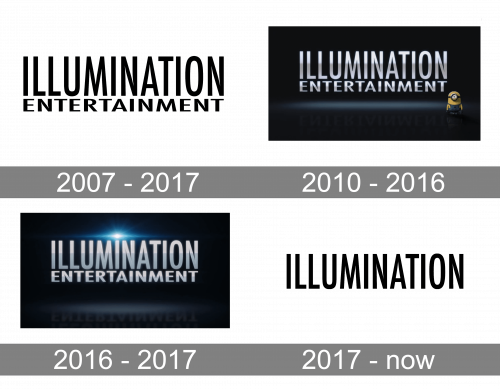
2007 – 2017
The company was established by Chris Meledandri in 2007 under the name of Illumination Entertainment. The original Illumination logo reflected this name. Here, you could see the lettering in white, like in the current logo. You would probably even have recognized the font used for the word “Illumination,” a minimalist sans serif font with elongated glyphs. The strokes were of the same widths.
The word “Entertainment” below sported a type with more regular proportions (closer to the square). The wordmark typically used a subtle grayish or bluish gradient, to add some depth and create highlights.
This version was used up to 2017, with several modifications listed below.
2010 – 2016
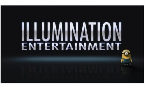
For the Despicable Me project, the company developed a version featuring a minion in the lower right corner. Each time the brand created a new feature film, it was released with an updated logo. While its overall style was the same, you could always see various creatures (especially minions) in various positions. The hues could also slightly vary, and white highlights could be used, too.
2016 – 2017
The type used in both the words grew bolder. While for most of the viewers, it was hardly possible to notice the alteration, a side-by-side comparison made it clear that the design was updated.
2017 – Today
When the name of the company was reduced to a single word, the logo went more minimalist, too. It still used the same elongated type as the previous one, which was bolder than on the earliest Illumination logo. It also had the same overall style, with the white letters over the dark background and with splashes of light here and there.
Font and Color
The narrowed uppercase lettering from the primary badge of the Illumination studio is set in a sleek and modern sans-serif typeface with condensed characters and clean contours. The closest fonts to the one, used in this insignia, are, probably, Futura Pro Medium Condensed, or Geometric 706 Std Bold Condensed.
As for the color palette of the Illumination visual identity, it is based on a timeless combination of black and white, which makes the logo powerful and elegant, and allows placing it on any background without losing its personality and recognizability.


