

![]() Family Feud Logo PNG
Family Feud Logo PNG
Family Feud is one of the most popular American television shows that started in the mid-1970s and is still a favorite of millions of viewers. Originally only in the USA, Family Feud is now broadcast in many countries under different names.
Meaning and history
![]()
Family Feud is one of those TV shows, which don’t lose its actuality in time. The show is still super popular not only among American households but worldwide. Family Feud debuted in 1976, on the ABC Channel with Richard Dawson as a host. In 1988 Richard Dawson was replaced by Ray Combs, who worked in the show for almost seven years. After that, Dawson came back, but not for long. Since 1999 Family Feud has changed its hosts several times, with the latest one — being Steve Harvey, who started working on the show in 2010.
As for the idea of Family Feud, it is a competition between two families. According to the rules, two teams compete for victory during four rounds and the final round by answering questions. The idea is simple – to guess the most popular answers about everyday things from different spheres of life. The team that guesses the correct or closest to the correct answer wins.
What is Family Feud?
Family Feud is the name of an American TV show, which debuted on the ABC Channel in 1976. Today the show has several adaptations in different countries. The main idea of Family Feud is a competition between two families, which answer common questions and win prizes.
In terms of visual identity, even though the logo Family Feud has been changed several times throughout the years, it has kept its style and recognizability due to using the oval medallion as the basis. However, there was one badge; which didn’t have the oval as its major shape.
1976 – 1985
![]()
The very first Family Feud logo, introduced in 1976, stayed with the tv show for almost ten years. It was a yellow and red banner in a Wild West style, with the solid yellow medallion featuring an ornate red frame and red uppercase lettering in a wishbone typeface.
1988 – 1994
![]()
The redesign of 1988 kept the shape but changed the style and the color palette of the badge. Now it was a calm blue embroidery background in a dark-red frame with white dots around the perimeter. As for the wordmark, it was set in yellow and was also stylized as embroidery.
1994 – 1995
![]()
In 1994 the logo of the tv show was redesigned again. The badge got volume and gloss, and now it was a three-dimensional medallion with a silver background and golden lettering. The frame of the oval was also set in gold. This version of the logo only stayed active for a year.
1996
![]()
1999 – 2006
![]()
The glossy gradients and the volume were kept after the redesign of 1999, however, the concept and the color palette were modernized. The oval got refined and colored in metallic blue, with the partial frame in dark gold. As for the inscription, it got rewritten in two styles, with the cursive golden “Family” in the title case set above the massive capitalized “Feud” in silver sans-serif characters.
2006 – 2007
![]()
The redesign of 2006 introduced the Family Feud logo without an oval medallion on the background. The new badge only consisted of the voluminous square lettering in two levels. All characters were set in gradient cold, with a dark purple-to-black outline and massive geometric shadows on the edges.
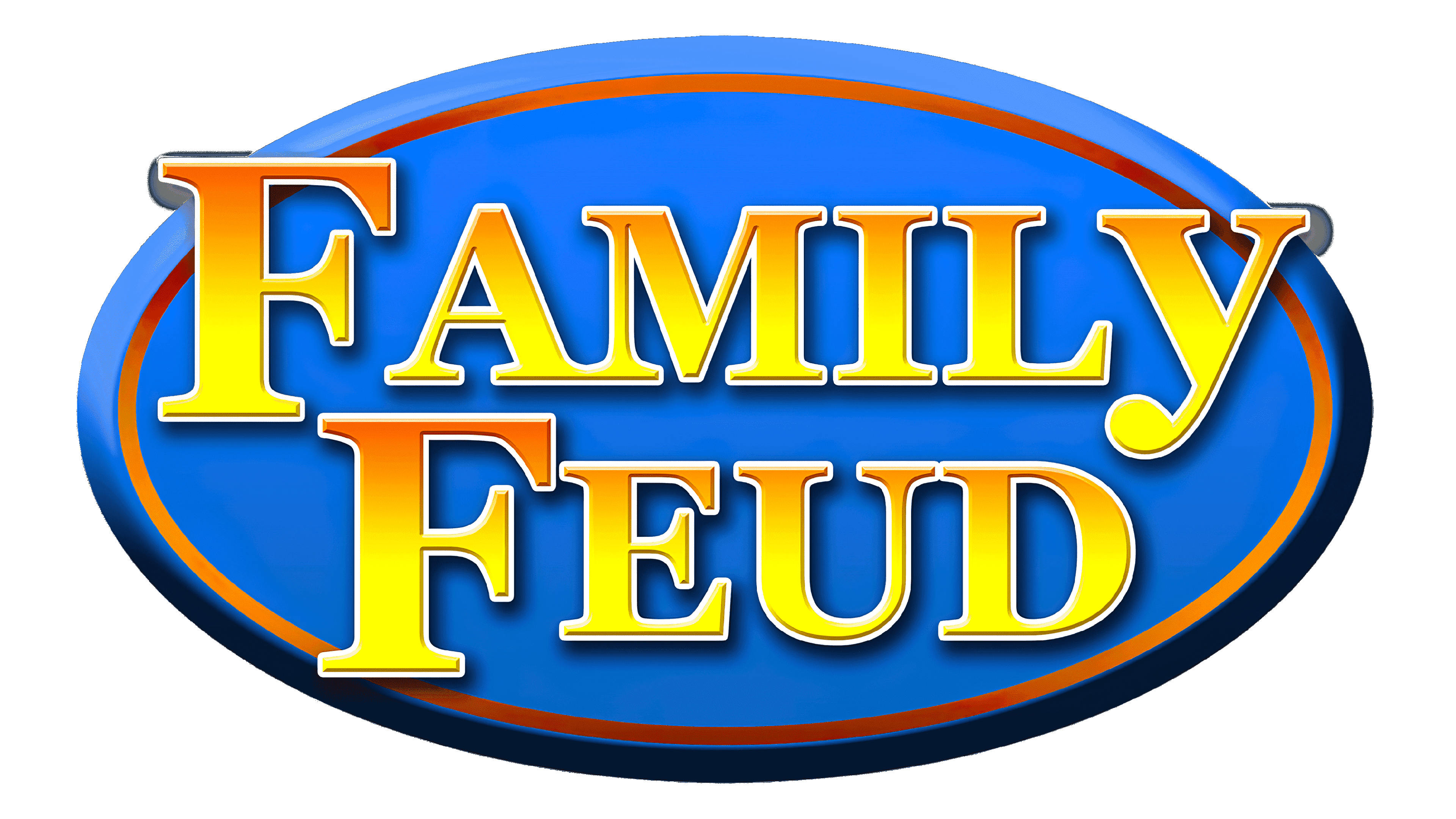
2007 – Today
![]()
The traditional oval medallion was brought back to the Family Feud visual identity in 2007. It was a glossy blue background with a massive reddish framing and three-dimensional lettering in yellow and orange gradients, set in a bold geometric serif typeface. There were several versions of this badge, with a darker background and intensified shades of the inscription.
Font and color
The bold, yet elegant lettering from the primary Family Feud logo is set in the title case of a classy serif typeface. The closest fonts to the one, used in this insignia, are Clarendon Bold, or Georgia Pro Bold.
As for the color palette of the Family Feud visual identity, it is based on the combination of blue and yellow and their gradients. The bright contrast makes the logo look friendly and energetic.


