Today, Iberia Airlines, founded in the late 1920s, flies to 115 cities in 39 countries. Iberia sends its passengers to a further 90 destinations with the help of partner companies. The fleet consists of over 80 aircraft, including the newest and most prestigious Airbus A350 airliners of our time. The total number of aircraft operated by the Iberia Group exceeds 140. Iberia is one of the most popular and reliable airlines in Europe, and in 2016, Iberia was named the world’s most punctual airline.
Meaning and history
Iberia airline dates back to June 28, 1927. It was on this day that this organization was founded by the financier Horacio Echeberrieta and the German airline Lufthansa. The launch flight was carried out exactly six months after its foundation. At first, the main function of the company was to carry out postal transportation between Madrid and Barcelona.
The company was nationalized in 1944. The first passenger flight after the war was from Madrid to Buenos Aires in 1946. Mass transatlantic flights began after the abolition of visas for U.S. citizens.
In the year of celebration of its 50th anniversary, the company carried 10 million passengers for the first time. In 2001, the company was privatized. In 2002, the total number of passengers, who used the carrier’s services, was 500 million people.
Iberia has been a member of the Oneworld airline alliance since 1999. The company is part of the Iberia Group. The group is engaged in air transportation of people and cargo, as well as maintenance of aircrafts.
Since 2010, the carrier has merged with British Airways. The alliance is called the International Airlines Group. Both companies operate under their own brands.
What is Iberia?
Iberia is a national airline of Spain, operating an international network of services. It has been a member of the international aviation alliance Oneworld since 1999. The airline’s route network includes over 120 destinations worldwide. In 2016 Iberia was recognized as the most punctual airline in the world.
1927 – 1939
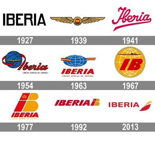
 The original design (1927) was the most minimalist one – nothing but the capitalized word “Iberia” in a legible sans. The x-height was slightly higher than the average.
1939 – 1941
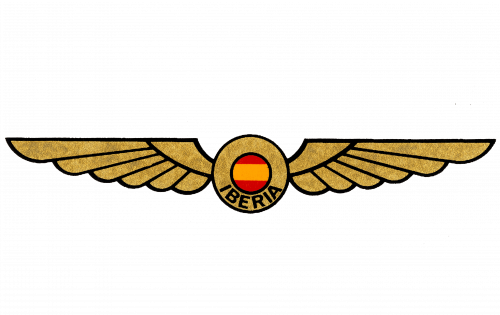
The first visual identity redesign was held by Iberia in 1939, and the badge was created in that year and stayed until 1941. It was a fancy rounded with the Spanish flag in the middle, and two extra-long stylized wings spread to the sides. The black uppercase “Iberia” lettering was written in the sans-serif typeface, arching under the flag circle in the center of the logo.
1941 – 1954
In 1941 the air carrier started using a smooth script logotype in bright red as its main badge. The inscription was placed slightly diagonally. And the tail of the letter “A”, underlining the whole name, had its end flared. This version of the logo stayed with the company for more than a decade.
1954 – 1963
The logo from 1954 was composed of a graphical emblem, depicting a blue and black globe with a yellow winged badge from 1939. The glide was outlined by a red ribbon, which came out of the letter “I”, in the custom bold cursive logotype in red, with a thick black outline. The logo had a tagline “Líneas Aéreas de España” in all capitals of a strict sans-serif typeface, in black.
1963 – 1967
The globe was horizontally extended in 1963. This time it was placed over the lettering and had a yellow and red ribbon (the colors of the Spanish flag) around it. As for the inscription, it was all solid red, it the uppercase of an italicized sans-serif typeface. The same tagline was set under the logo, with the letters enlarged and slanted.
1967 – 1977
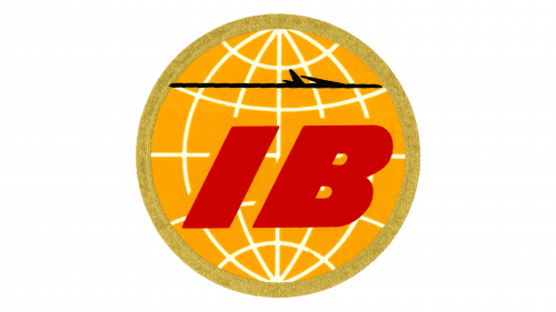
The badge of 1967 was completely different — a bright yellow globe in a thick yellow outline, with two extra-bold red “IB” letters on it and a thin black horizontal line above the letters. The small black plane was coming out of this line, flying to the right, bringing the passengers into the future.
1977 – 1992
 In 1977, the era of the stylized “B” design started. The original version was dominated by the “B,” while in the secondary logo, the letter was smaller.
1992 – 2013
The bold stylized “B” in yellow and red was placed on the right from the italicized sans-serif “Iberia” inscription in solid red. It was a stable and confident badge, representing power, passion, and determination. It also evokes a sense of energy and vitality.
2013 – Today
While the dynamic abstract shape featured in the current logo (introduced in 2013) references the “B,” it has an incredible modern, dynamic, and memorable style.
Font and color
The modern sleek typeface of the uppercase inscription is custom and exclusively designed for the air carrier. The font was probably based on one of the following typefaces: Makro XM Extra Bold, Ansage Semi Bold XP, or Nuber Next Heavy Extended. But with lines modified, arched, and softened.
As for the color palette, the combination of dark shades of red and yellow make the logo eye-catching and instantly recognizable, evoking a sense of power, determination, and progressiveness.


