Hudson, primarily known for its automotive pursuits, was an American car manufacturer. It was founded in 1909 and was owned by Joseph L. Hudson. The company made significant inroads in the automotive industry, producing cars primarily in Detroit, Michigan. By the mid-20th century, Hudson merged with other companies, evolving its business landscape.
Meaning and history
Hudson Motor Car Company was established in 1909 by Joseph L. Hudson in Detroit, Michigan. Throughout its existence, Hudson produced innovative vehicles and introduced several industry-firsts, including the “step-down” auto body construction. Their cars were renowned for their performance and durability, often participating in competitive events. As of the mid-1950s, Hudson merged with Nash-Kelvinator, forming American Motors Corporation (AMC), marking the end of the Hudson brand as an independent entity.
What is Hudson?
Hudson was an American automaker founded in 1909 by Joseph L. Hudson. Based in Detroit, Michigan, the company produced innovative vehicles until its merger in the mid-1950s.
1909 – 1938
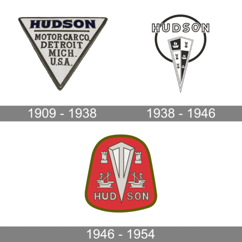
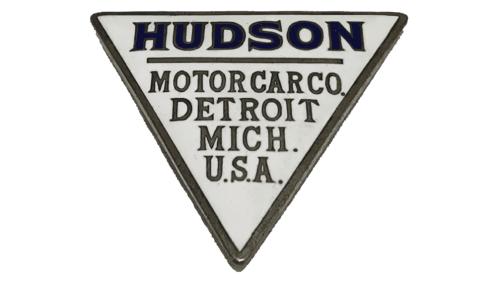
The geometric shape of the emblem as well as the bold font with flare serifs used for the name create an image of a strong company. The name is printed at the top of the triangle, while the next four lines specify the direction of the company, Motor Car Co., and its location – Detroit, Mich., U.S.A.. Beside a border that creates an illusion of a three-dimensional shape, there are no decorations or other elements.
1938 – 1946
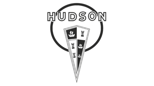
This logo resembles a key with “Hudson” printed across the top using a bold, sans-serif font of a white color with a black outline. The “key” consists of a relatively large black ring and a triangular-shaped shield. The latter is pointing down and about halfway in the ring. It has a black-and-white checker pattern with symbols in each section. These symbols include a tower and a ship that reflect the strength and richness of any kingdom.
1946 – 1954
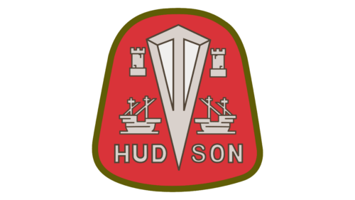
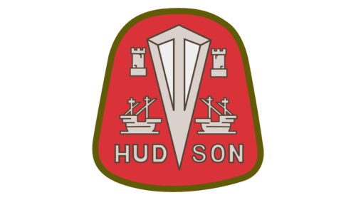
This logo looks bold thanks to the red color palette, although not as modern. It has a rounded bell shape of red color with a green outline. The shield from the previous emblem now looks more like a diamond, although it is done in off-white and beige colors. A ship on either side of it at the bottom and a tower at the top decorate the remaining space in the emblem. The pointed end of the diamond split the “Hudson” inscription at the very bottom. It is done using a very similar font as in the earlier version.


