Howard Johnson is a hospitality chain that was established in 1925 as a restaurant business and changed its specialization in 1954. Today the company is run by Wyndham Group and has over 300 hotels and motels across America and Canada.
Meaning and history
Howard Johnson is the name of an American chain of hotels and restaurants, currently owned by the Wyndham Hotels & Resorts Group. The chain was established in 1925 and named after its founder, who managed to build the largest chain of restaurants in the USA by the 1960s. Today Howard Johnson by Wyndham has almost 300 locations across the country.
Wyndham Hotels & Resorts Group is the second-largest hotel chain in the world. It owns hotels and resorts in 67 countries, mostly in the United States and Canada, and includes about 7 thousand hotels with a total room inventory of almost 600 thousand rooms.
Wyndham Hotel Group Corporation was founded in 1981 in Dallas and today includes such brands as Wyndham, Wingate by Wyndham, Hawthorn Suites, Ramada, Knights Inn and AmeriHost Inn, Days Inn, Super 8, Baymont Inn & Suites, Microtel Inns and Suites, Travelodge, Howard Johnson.
1925 – 1930s
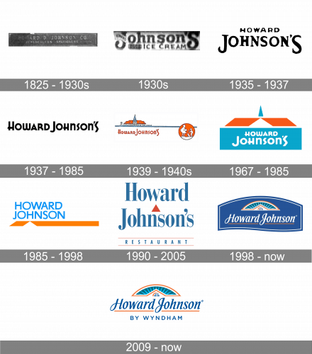
The original logo ofHoward Johnson’s chain was introduced in 1925 and featured a simple composition withbold uppercase lettering in a narrowed serif font written across a dark horizontally-oriented rectangular banner in a delicate geometric framing.
1930s
The first redesign of the Howard Johnson’s badgechanged the style of the lettering, enlarging the “Johnson’s” part and writing it in a custom smooth fit with elongated and slightly curved lines. This badge was used for the chain of ice-cream cafes, at the beginning of the 1930s.
1935 – 1937
In 1935 the logo of the chain was redesigned again. The new concept was based on a black two-leveled inscription written against a plain white background. The top levels featured the small uppercase “Howard” in an extended hand-written font, and the bottom — an enlarged “Johnson’s” in the bold serif type, with the “J” and the last “S” enlarged.
1937 – 1985

The first-ever logo was just a black wordmark of their name, then – ‘Howard Johnson’s’. The font was a pleasant, artistic style with a lot of sharp angles, but also round forms and loose proportions.
1939 – 1940s
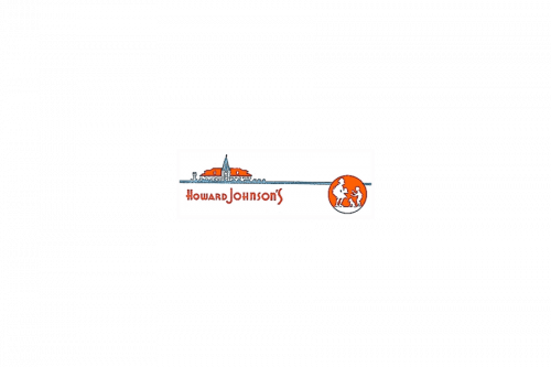
The following logo depicts also the image of the brand’s first premises – a white building with an orange roof and tall tower in the center. From it, they drew a long blue lane that ran to the right. On its end, there was an orange emblem of a waitress serving a boy and a dog. The wordmark, written in orange, was right underneath the building image.
1967 – 1985

In 1967, they decided to concentrate on the image of the shop. They made the whole logo just that building, but revised the design into simpler forms. There was now a big turquoise rectangle with two tilted orange rectangles above (serving as a room), plus a blue peak above all of it.
The foremost blue portion also held a white wordmark very similar to previous designs.
1985 – 1998

For the 1985 emblem, they reimagined the wordmark style. It became a collection of big turquoise letters – all using a rather basic sans-serif font. Beneath it, there were two orange figures as the ones from the 1967 logo. Except, they are smaller, and the right one is extended all the way to the right edge of the canvas.
1990 – 2005
For the chain of restaurants underHoward Johnson’s brand, the new logo was created in 1990. The badge was based on a blue and orange color palette, with the narrowed blue lettering in two levels, executed in a bold and elegant serif typeface, separated by a solid orange triangle, set between the lines, and complemented by a lightweight “Restaurants” enclosed between two thin orange horizontal lines, at the bottom of the logo.
1998 – Today
It looks like a rectangle, but with a lot of curved and warped lines. As a result, the wordmark – now made in cursive – is white for contrast.
2009 – Today
Named after its founder, Howard Deering Johnson, the hotel chain boasts a traditional visual identity, evoking cozy feelings.
The Howard Johnson logo is composed of an underlined wordmark with an emblem above it. The inscription in a cursive typeface is neat and clean, all the letters are separated from each other, except “J” and “O” connected. The first letters of the two words boast elongated curved tails, which add elegance to the logo.
The Howard Johnson emblem is a stylized image of the roof with a window in it and a blue sky, enclosed in a half-circle frame above it. The blue and orange color combination of the emblem makes the logo look warm and kind, evoking a welcoming feeling.
The orange underline of the wordmark balances the emblem and adds a bright accent to the whole logo.
The Howard Johnson visual identity is traditional and timeless. It represents a stable company with values of roots and heritage. The company, that aims to provide its customers with the best services for their comfortable stay.
Font and color
The elegant lettering from the Howard Johnson’s by Wyndham logo is set in two levels, executed in two different styles. The top line of the composition is set in a slanted cursive font with interesting, slightly sharpened contours of the characters. The font used for this part of the logo looks close to such types as Every Text Bold Italic, or Bartholeme Medium Italic, but with some significant modifications. As for the bottom line of the logo, it boasts a modern uppercase inscription in a clean sans-serif font, similar to Saa Series E D, or URW Grotesk Small Caps Regular.
As for the color palette ofHoward Johnson’s by Wyndham visual identity, it is based on a calm and deep combination of blue and orange, where blue stands for professionalism and high quality, and orange represents energy and progressiveness.


