Holiday Inn Express is a mid-priced hotel chain including over 2,800 hotels. The chain belongs to the InterContinental Hotels Group family of brands.
Meaning and history

The look of the Holiday Inn Express logo has always depended on the visual identity of the parent brand, Holiday Inn.
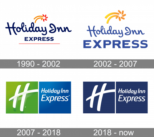
1990 – 2002
The first three locations opened in the United States in 1991. The original logo borrowed the script from the main Holiday Inn wordmark, which, in its turn, was inspired by the iconic “Great Sign.” The “Great Sign” was the roadside sign the company used a lot during its first era of expansion (in the 1950s-1970s).
The star above the wordmark was inspired by the pentagon seen on the “Great Sign.” The parent brand’s logo also featured a star but it was different. Here, the star was larger and static, while in the Holiday Inn Express emblem, it was more of a comet. It added a lot of motion.
Apart from the star tail, the list of differences from the parent company’s logo included the color (dark blue) and, of course, the word “Express.”
2002 – 2007
The word “Express” grew more prominent, while the orange bar below disappeared. As a result, the logo became cleaner. The updated palette of the star, where two colors were replaced by a softer gradient, contributed to this aim, too. The type was slightly tweaked, although the alterations were hard to notice even if you compared the two versions side-by-side.
Also, now, the logo seemed to draw a better border between the parent brand and the “Express” brand. Interestingly, the primary Holiday Inn logo of that era didn’t even include the star and featured a green-dominated color palette, which placed the two brands even further from each other.
2007 – 2018
In 2006, the Holiday Inn Global Brand Relaunch was announced. The new logo was part of it.
Gone were the star and the cursive handwriting. Instead, the lettering “Holiday Inn” featured a simple type consisting of italicized block letters. The lettering, which looked the same as on the parent brand’s logo, was designed by the Interbrand agency. Below the lettering “Holiday Inn,” there was the word “Express” in larger glyphs of the same style.
The name of the chain in white was placed inside a blue square. To the left, there was a green square housing the letter “H” from the parent brand’s logo (also designed by Interbrand).
2016
In 2016, Holiday Inn modified its logo getting rid of the green square and altering the type. The most notable alteration of the font concerned the “H” – it lost its extended middle bar.
Yet, the font of the Holiday Inn Express logo remained the same. It retained the longer middle bar.
However, now, both the squares feature the same color. The version on the corporate website showcases a dark blue text inside white squares, but there is also a version where the text is white inside the dark blue squares.
2018 – Today
The redesign of 2018 has created a more confident and professional look for the official Holiday Inn Express badge. The designers decided to keep the concept of the previous version, but switched a color palette to deep blue and white and removed all the gradients, so the banner started looking more solid and chic. The new shade of blue, used for the badge of the hotel chain, represents strength and reliability, showing the potential customers a high level of services, provided by the group.
Font and color
The lettering from the primary Holiday Inn Express badge is set in two levels with the characters set in two different sizes: the top “Holiday Inn” is smaller than the “Express”, placed under it. The closest fonts to the one, used in this insignia, are, probably, Mahameru Oblique, or Fonia Italic, but with some modifications of the slanted title case characters’ contours.
As for the color palette of the Holiday Inn Express visual identity, it is based on a simple yet strong combination of dark blue and white, which evokes a sense of reliability and professionalism. White here stands for trustworthiness, while blue represents confidence and stability.


