Holsten is a brand of premium malt beverage, founded in 1879 in Hamburg, Germany. The brand was acquired by Carlsberg Group in 2004 and now has seven breweries in Germany.
Meaning and history
Since its birth in 1879, the Holsten trademark, defended by the Holsten Knight, has been a symbol of superior quality. The Holsten knight on the brewery’s steed guarded over it from the rooftop for over 130 years. Until now the Knight is the main element of the brand’s logo. Executed in black with a red shield with a letter H on it.
What is Holsten?
Holsten is the name of a beer brand, which was established in Germany in 1879. The products of the brand are exported all over the globe. Since 2004 Holsten is owned by Carlsberg Group, one of the largest European players In the brewing industry.
Old

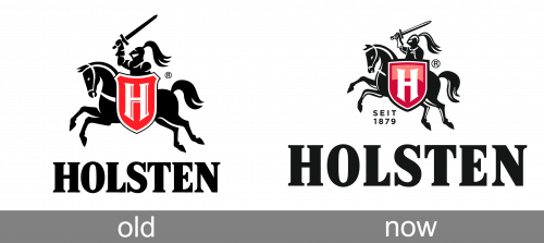
The Old Holsten logo doesn’t differ much from the badge we all can see today. It was still the same knight on a horse, executed in black, and moving to the left. The knight had a solid red crest with the bold white “H” on it in one hand, and a spork in the other. The graphical part of the logo was accompanied by the bold serif “Holsten” wordmark in the uppercase. The letters were written in extra-bold bars with short and thin serifs with rounded ends.
Today
The Holsten wordmark is strict and simple yet elegant. It hasn’t changed much over the years, as well as it’s color – black.
As for the icon, until late 1990’s it was a red seal-type logo with a black silhouette of knight on it. A warrior image on a logo usually represents strength and the brand’s adherence to principles and quality. The Holsten logo symbolizes many years of work and devotion to its cause.
The whole Holsten’s identity is masculine and confident in its character and highlights it’s German heritage.
Font and color
The bold uppercase lettering from the primary Holsten badge is set in a heavy serif typeface, with the slightly narrowed characters written in extra-thick lines with massive triangular serifs featuring slightly rounded angles. The closest fonts to the one, used in the Holsten insignia, are, probably, Caslon Black Regular, Pleasantwood JNL, or DIN Neue Roman Black, but with some slight modifications.
As for the color palette of the Holsten visual identity, it is set in a powerful and timeless combination of black, red, and white, which evokes a sense of professionalism, excellence, and sophistication. Black here is the main shade, which looks brutal and masculine, while red and white accents add lightness, style, and passion to the overall composition.


