

![]() Hearthstone Logo PNG
Hearthstone Logo PNG
Hearthstone is one of the most commercially successful products of Blizzard Entertainment, an American video game developer and publisher. It is a free-to-play online digital collectible card game echoing their Warcraft series. The game was unveiled in 2014.
Meaning and history
![]()
The Hearthstone logo didn’t change much during the first years of the game’s existence. This approach helped to retain loyal customers. When the logo was tweaked, it didn’t affect the overall style. Moreover, the majority of users probably didn’t even notice the update.
What is Hearthstone
Published and developed by Blizzard Entertainment, Hearthstone features cross-platform play. The online digital collectible card game is free to play. It was an experimental project created by a smaller team than other products of Blizzard.
2013 – 2016
![]()
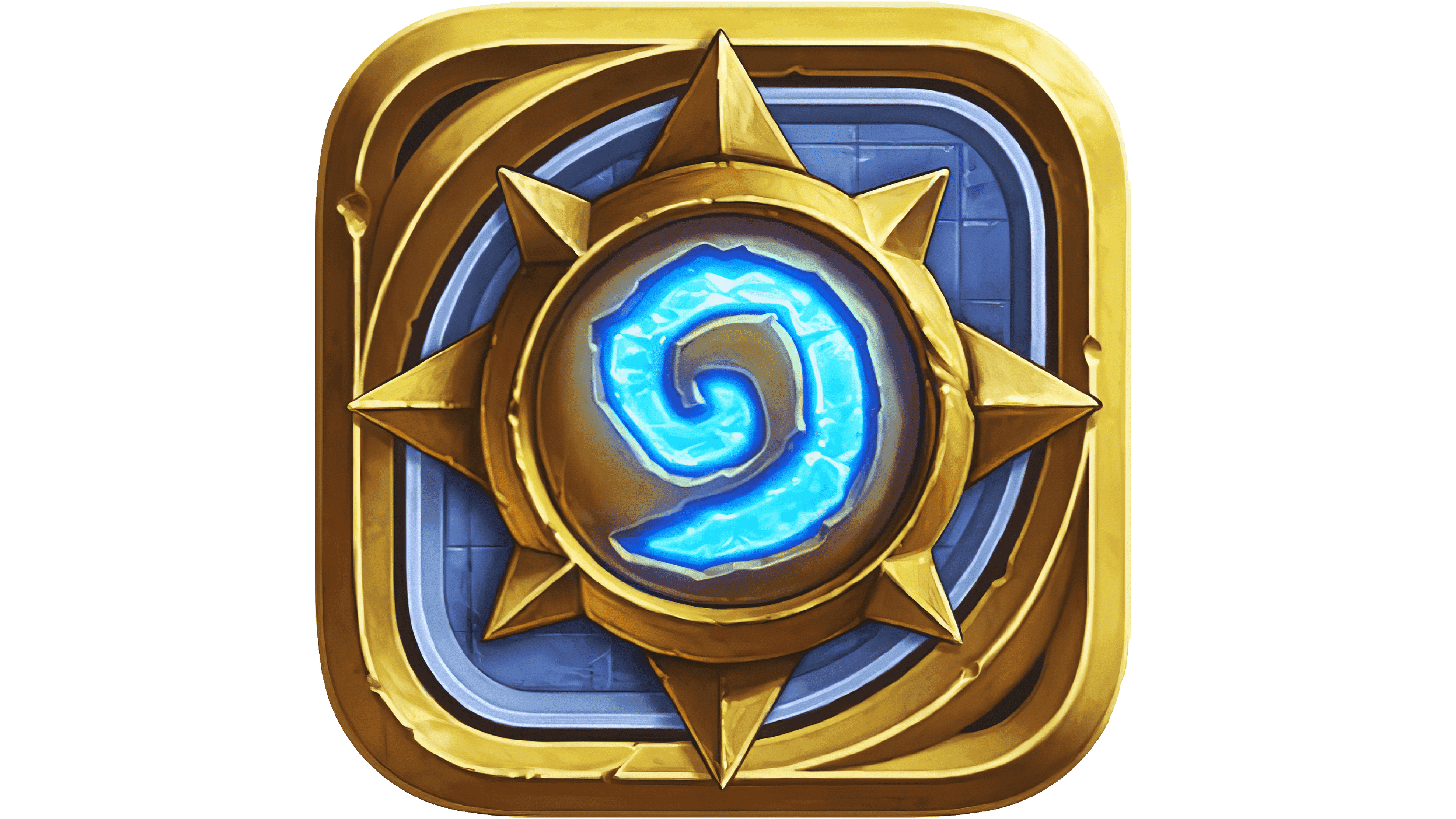
The original logo already had that recognizable structure that is synonymic with the brand. The centerpiece of the design was the name of the game. It was written in a single line and slightly arced.
Also, the letters were slightly tilted backward. Due to this, they looked like a sort of a swing bridge or gate that opens by going down. It seemed that the following second, the lettering will go completely down and open the entrance to a mysterious place.
The “O” looked like a magic symbol, a spiral shining with soft blue light. As if it was something you’ve just turned and which set the mechanism in motion.
The other letters looked more regular providing adequate legibility. At the same time, they seemed to be made of stone, which supported the idea of a sort of a bridge and secret mechanism that opens up to those who know the code.
Below, you could see the lettering “Heroes of Warcraft.” The subtitle reminds us of the fact that the game is based on the story of the Warcraft series of video games by utilizing the same characters and relics, for instance.
2016 – present
![]()
The difference between the old Hearthstone logo and the following one becomes obvious only as a result of a side-by-side comparison.
To begin with, the colors have grown slightly more vivid and light. It seems that a source of light was placed behind the logo. In fact, you can even see this source of light (or a hint on it, at least) in the fiery golden strokes above and below the “T” and “H.” This seemingly minor update made the design more alluring as it suggests that the world into which the game leads you is even more interesting than before.
The texture of the letters has changed, too, although you can clearly see it only in larger sizes. The old one was grainy. The 2016 version combines larger patches in slightly different shades. It might be described as similar to metallic or similar to marble, although in fact, it is none of these. Anyway, there’s some dynamism in it.
The “R” has a longer swoosh, which became more appropriate since the “Heroes of Warcraft” tagline disappeared.
Colors and Font
The palette is based on various shades of gold. The different hues have been used to add some depth to the surface of the letters. The volume also comes from the dark gold outline the letters have. Also, there is a “stone” background, which also contributes to the impression of depth.
The blue used for the “O” becomes a bright accent.
The letters used in the Hearthstone logo were drawn specifically for the purpose, to fit the overall design concept.


