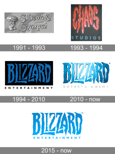
Blizzard is a Video-games developing company, which was established in 1991 in the United States. The studio started creating its games only in 1993, and before that, it was specialized in manufacturing ports for other brands.
Meaning and history
What is Blizzard?
Blizzard is one of the world’s most reputable game developers, which is famous for its hit game series such as Diablo, WarCraft, and StarCraft. the company was founded on February 8, 1991, as Silicon & Synapse, Inc.by Michael Moreheim, Frank Pierce, and Allen Adham, graduates of the University of California.
1991 – 1993
In 1991, Alain Edham and his friend Mike Moreheim started their own company. They named it Silicon & Synapse. The start-up capital of the company was ten thousand dollars. In addition to the founders, there was another person, Frank Pierce, who became the company’s first employee.
In the first two years of the company, neither Allen Edham nor Mike Moreheim gave away their salaries. They tried to invest everything in the business.
One of the company’s first successful projects was The Lost Vikings. It saw the light of day in 1992 and was released in versions for DOS, Amiga, Sega, and several other less popular platforms. Following the success of The Lost Vikings, S&R developed Rock’n’Roll Racing.
1993 – 1994
Financially, however, the company was in poor shape, so in 1993 Silicon & Synapse was bought by Davidson & Associates.The deal amounted to 10 million USD, which was a real boost for Silicon & Synapse and fulfilled Alain Edham’s long-held dream of making money producing computer games.
After receiving funding from Davidson & Associates, Edham and Moreheim decided to change the name of the company, and in 1994 the S & S was officially renamed Blizzard. And in the same years, under this brand the company’s first product WarCraft was released.
WoW is by far the most popular online MMORPG in the world. The audience of the game is more than 10 million active users.
1994 – 2010

The first Blizzard logo was created in 1994 and became a basis for the design we all know today. The initial badge featured a black rectangular background, oriented horizontally; and a dark blue custom uppercase inscription on it. The uneven letters with “pixel-like” contours and sharp ends of the lines looked a bit spooky, but still playful and very memorable. The “Entertainment” tagline was set under the black badge, in black color, with its uppercase letters, placed with a lot of space between each other, executed in a modern and clean sans-serif typeface.
2010 – Today
The redesign of 2010 has introduced a three-dimensional version of the Blizzard logo, with the glossy blue lettering gaining shiny surface and a thin black frame, and being placed against a plain white background, with the voluminous silverish underline, set in a refined and emboldened sans-serif font.
2015 – Today

The Blizzard visual identity is based on the nameplate, which looks artistic and cre-ative due to the typeface used. The blue color of the lettering is one more element, which makes the Blizzard logo recognizable across the globe.
The Blizzard nameplate in all the capital letters is executed in a custom typeface with uneven lines. The font is similar to The Burning Crusade font.
The lettering is narrowed and vertically stretched, creating a striped pattern, which looks a little ominous, especially in the brand’s signature color palette.
The Blizzard color scheme is blue on black. The lettering uses gradient blue in order to create a three-dimensional effect, while the background is solid.
The “Entertainment” tagline in all-caps is written in white using a simple sans-serif typeface and adds balance and lightness to a dark company’s logo.
The Blizzard logo is iconic and very well-known all over the world. It is a great rep-resentative for one of the gaming industry leaders, with a perfect reputation and progressive approach.
Font and Color
The unique designer typeface of the lettering from the primary Blizzard logo looks very dramatic, and evokes mixed feelings, as the uneven contours and sharp angles of the bold and narrowed capital characters look a bit scary, but the bright blue shade creates a friendlier image, representing the professional sides of the company.
The closest font to the one, used in this insignia, is, probably, Vampliers Regular, but with some significant modifications of the characters’ contours.


