Wolfenstein is a video game, developed by Muse and released in 1981. The games bring a player into the World War II times and tell a story about the fight between American captain and Nazis. The game is available for all the operating systems, consoles and mobile devices.
Meaning and history
The contemporary and sharp Wolfenstein logo is instantly recognizable among gamers all over the globe. It looks young, strong and stylish.
The Wolfenstein logo is composed of a wordmark and an emblem, which is usually used on its own, as an icon.
The Wolfenstein nameplate is written in a custom sans-serif typeface with sharp-pointed angles and elongated tails of the letters. “W”, “L”, “F” and “T” have their long tails cut diagonally, which adds dynamics and energy to the logo.
The wordmark is executed in the lowercase letters, with only “W” capitalized, but it doesn’t look much bigger than other letters of the nameplate. The Wolfenstein logo-type looks balanced and harmonized, with its thick lines and narrowed letterforms.
The Wolfenstein emblem depicts the first letter “W” with additional graphics. The letter has a kind of flashlight crown above it, which looks like a continuation of the vertical bars.
The modern Wolfenstein logo is a perfect representation of the game’s spirit and nature. It is sharp, strong and fresh, evoking a sense of courage and a fighting mood.
1981
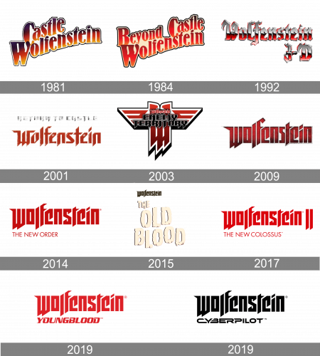
The original logo was designed for the game when its name was Castle Wolfenstein. It was a gradient black, red, and yellow lettering in a custom heavy font with smooth elongated lines and a black and white outline of all characters. The color palette of the badge repeated the scheme of the German flag.
1984
The redesign of 1984 has added the word “Beyond” to the composition, and switched its color palette to a lighter one, with the black almost fully removed from the nodes of the characters, but the black outline getting thicker and more distinctive. The edge between red and yellow has been almost erased, and the white background of the wordmark was replaced by a smooth warm crème one.
1992
In 1992 the badge for the game was completely changed. Now it was a three-dimensional sharp Gothic lettering in red and glossy silver, with black shadows and outlines, adding distinction to the inscription and making it look more powerful, at the same time allowing placing it on any background.
2001
The redesign of 2001 has created a prototype of the badge we all can see today. This was the initial version of a super cool and sharp inscription in dark red. In the very beginning, the characters were set in the title case and had their contours slightly stretched horizontally. Sometimes the main logotype was accompanied by an additional inscription in silver.
2003
The Wolfenstein logo was changed again in 2003. The new badge features a black two-leveled lettering in a heavy sharp font, written across the top part of a white and red emblem, with the stylized vertically stretched letter “W”, decorated by two short geometric wings, drawn in three horizontal lines with diagonal cuts.
2009
In 2009 the font, which is still used by the franchise today, was created for Wolfenstein. The original version was executed in gradient shades from black to red, with a textured surface of the characters, which made the badge look three-dimensional. Each of the characters was outlined in dark silver, with a metallic gloss, adding sharpness and a sense of danger to the composition.
2014
For “The New Order” edition of the game the new badge was introduced in 2014. The main logotype was rewritten in a flat style, with just one shade Ses for the characters — plain scarlet red. The heavy inscription was underlined by an uppercase sans serif lettering with the name of the game’s edition, in the same shade of red, but with a smaller size and thinner lines.
2015
The redesign of 2015 has introduced a cool and light version of the logo, designed for “The Old Blood” chapter of the Wolfenstein game. The name of the franchise was set in small black capitals above the enlarged stylized light-crème lettering, set in three levels across the main part of the badge.
2017
For the Wolfenstein II: The New Colossus, the badge, designed in 2014 changed its color palette to a lighter one, with the tagline rewritten, and the Wolfenstein logotype being followed with two elongated vertical lines, with their bottom parts pointed.
2019
For the “Youngblood” edition of Wolfenstein, the tagline has switched its typeface to a more complicated and bold one. It was set in a heavily stylized serif font with the slanted characters looking very progressive and evoking a sense of motion and energy, which worked brilliantly with the stable and brutal top part of the logo.
2019
The version of the badge, used for the Cyberpilot edition of the famous game can usually be seen in solid black, but sometimes switched its color to red. The only difference between this badge and the previous one is in the style of its tagline. The “Cyberpilot” lettering is set in the uppercase of a bold futuristic sans-serif font with clean contours and thick lines of the letters.
Font
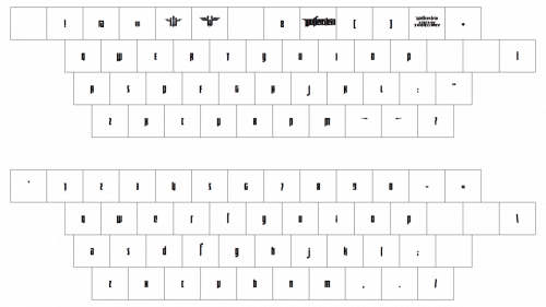
The custom designer typeface from the primary Wolfenstein logo was created exclusively for the game, andits sharp heavy elements represent its plot, evoking a sense of danger, and associations with fighting and blood. The closest fonts to the one, used in this insignia, are, probably, Black Mustang Regular, or Eternal Ego Regular, but with significant modifications of the contours.
As for the color palette of the Wolfenstein visual identity, it is based on a deep and calm shade of red, which elevated the dangerous mood, created by the font of the lettering, and made the badge look even more mysterious and powerful.


