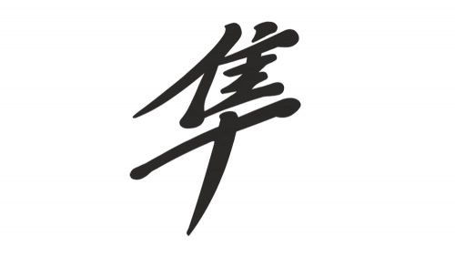
The Suzuki Hayabusa is a sportbike motorcycle manufactured by Suzuki since 1999. The dynamic, intricate design featured on it has become a symbol of freedom and speed for thousands of Hayabusa guys.
Meaning and history
The Hayabusa logo has not looked the same throughout its more than 20-year history. While it has always consisted of the same two parts (a hieroglyph and the word “Hayabusa” in English), their color, position, and comparative size have varied.
The lettering “Hayabusa” is given in a handwriting-inspired type and placed over the Japanese name. The hieroglyph belongs to Kanji, a system of Japanese writing using Chinese characters. Its pronunciation is “hayato” or “hayabusa.” The hieroglyph means “strong and fast.” We should also add that in translation from the Japanese language this word means the Peregrine falcon. It is known as the fastest bird in the world and the fastest member of the animal kingdom – it can reach over 320 km/h (200 mph) during its high-speed dive.
Suzuki has not been the first to use the word “Hayabusa” to name something other than the bird – in Japan, there is a very fast train with this name. Also, it was used to refer to a WWII Japanese aircraft. According to some sources, the person who came up with this name for the motorcycle was Akihiko Muramatsu from the Suzuki Product Planning group.
Colors
In some versions of the logo, the palette seems to have been inspired by the gold, bronze, and silver hues of the Peregrine falcon’s feathers. You can also come across versions in other colors, though (red and yellow, for instance).


