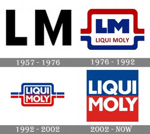
Since 1957, when Liqui Moly GmbH was founded, its logo has gone through at least three major updates.
Meaning and history
The history of the Liqui Moly brand began occasion, after the war with a chance find of a German citizen Hans Henle. In an American Army store, Hans found a container with a liquid, which had to be added to engine oil. The bottle had a Liqui Moly brand name on it. The properties of the compound interested Herr Henle so much that in 1955 he bought the rights to the brand and two years later, in 1957, he founded the company Liqui Moly GmbH.
Today Liqui Moly is a famous, innovative, and dynamically developing German company located in the city of Ulm and producing more than 6 thousand types of products. For more than half a century of its history, Liqui Moly has earned a reputation as a reputable company, firmly holding leading positions in the market of motor oils and automotive chemicals. Now the brand is represented in more than 110 countries, and the product range includes a full range of lubricants
What is Liqui Moly?
Liqui Moly is a German company manufacturer of automotive oils, lubricants, and additives. The company was established in 1957, and today has over 6 thousand products in its portfolio. The company’s headquarters and production of additives and automotive chemicals are located in the city of Ulm, and its oil production plant – is in Saarlouis.
1957
The original Liqui Moly logo showcased only the initials of the company’s name, the “L” and “M.” The style of both the characters was similar: the letters were very heavy and belonged to a sans serif typeface. Also, they had average proportions. You could hardly notice anything unusual about them at all, apart maybe from the “cut” top angles on the “M” (which is not a very rare detail, to tell the truth).
1976
The second version was more distinctive. Also, this time, it was easier to identify the company to which the logo belonged as there was the lettering “Liqui Moly,” in addition to the abbreviation “LM,” which was borrowed from the previous logo and remained unchanged. The full name of the company was given in red. The type was a simple sans. It was by far lighter than that used for the characters above.
The words “Liqui Moly” were separated from the letters “LM” by a thin horizontal bar in blue. Around the logo, there was a thin border forming a rectangle with rounded corners.
1992
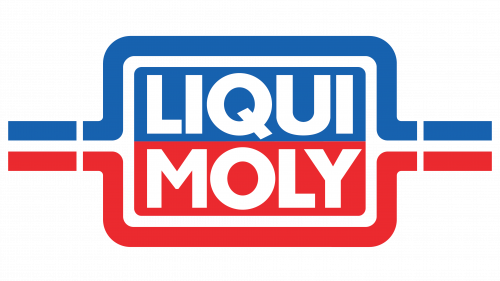
The design went through a complete overhaul. The abbreviation was gone. The words “Liqui Moly” were now given in two lines and were white. They were placed inside a rectangle with rounded corners. The rectangle was broken down into two identical parts. The word “Liqui” was housed inside the blue half, while the word “Moly” was housed inside the red half. Around the rectangle, there was a border in white, red, and blue.
2002
The current Liqui Moly logo is basically a simplified version of the 1992 logo. The borders have been removed leaving only the red and blue rectangle housing the name of the company.
Font and Color
The heavy geometric lettering from the primary Liqui Moly logo is set in a clean and stable sans—serif typeface with distinctive contours and straight cuts of the bars. The closest fonts to the one, used in this insignia, are, probably, GR Milesons Three, or Zelda Extra Bold, with some minor modifications of the contours.
As for the color palette of the Liqui Moly visual identity, it features bright shades of blue and red, accompanied by white, which adds lightness and a sense of loyalty and reliability to the strength, energy, and confidence of the badge’s color scheme.


